Over the last decade-plus, NHL teams have been getting creative when redesigning their logos or creating their third alternate jerseys. New sleek designs have been on the rise lately, which beckons the question of what will happen to older jerseys as the years pass by.

Teams such as the Minnesota North Stars, Hartford Whalers, California Golden Seals, Quebec Nordiques, and Colorado Rockies might be gone from the NHL, but they certainly shouldn’t be erased from the memories of hockey fans. As a matter of fact, if one attends enough hockey games for a given NHL team, then chances are that they will run into most, if not all, of the jerseys shown below. Much in the same light, the new generation(s) of hockey fans also deserve to have a bit of hockey history embedded in their minds – even if that history is dictated through a team’s apparel.
Oldies, But Goodies
Minnesota North Stars (1988 – 1991)
Before the Minnesota Wild brought NHL hockey back to the “State of Hockey”, the North Stars reigned supreme in Minnesota. Commonly known as the “North Star State”, the team’s name and jersey logo were obvious references to the franchise’s location.
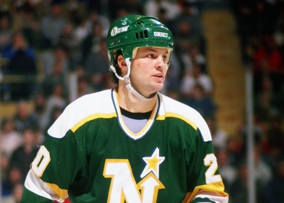
Throughout their history, the North Stars stayed true to their original colors as they never really departed from using the gold, green, and white scheme in their jerseys – with the obvious exception of the above jersey which included a previously unused black stripe. In this case, not abandoning their design scheme was the best option for the North Stars as they managed to retain their historic colors and add a subtle, yet pleasant, alteration to their road jerseys.
Hartford Whalers (1992-1997)
The Hartford Whalers might have changed up their colors for the last five years of their existence in the NHL, but they never did any harm by doing so. The Whalers kept their original logo, but what made this jersey all the more noticeable were the dark blue and grey color schemes that were added.
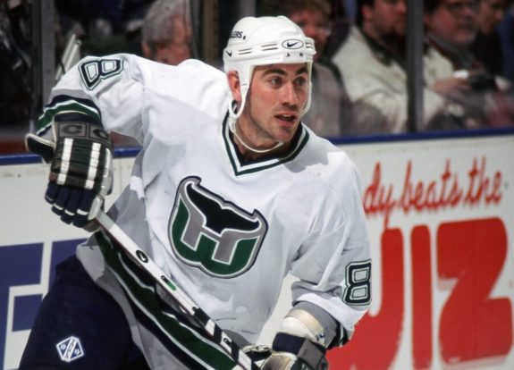
The whale tail, the letter “W”, and the “H” in the middle of the logo all remained the same, but the new colors undoubtedly helped catch the attention of hockey fans. Of course, the original green Whalers jerseys caught the eyes of fans, but the 1992 redesign arguably followed the refashioning period of the 1990s – one that saw the Whalers successfully add new and easily digestible colors to an already popular jersey.
Quebec Nordiques (1980-1995)
Before they relocated and became the Colorado Avalanche, the Quebec Nordiques had a jersey that was known around the league. While newer hockey fans might not be acquainted with the Nordiques’ jersey, one look is all that one probably needs in order to get familiarized with a bit of Canadian hockey history.
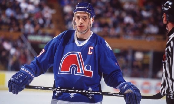
Much like the previous two sweaters on this list, the logo design (an igloo with a hockey stick and puck next to it) is simple, and the three separate fleur-de-lis prints on the bottom only add to the allure of the jersey.
California Seals (1967)
In 1967, the California Seals were inducted into the NHL and also had a very unique uniform. Despite the fact that the Seals didn’t last a decade in the league, the team’s use of basic green, white, and blue colors on their jerseys, along with a seal holding a hockey stick inside of the letter “C” were absolutely brilliant, in my eyes at least.
Behind the white backdrop of the jersey, one can tell exactly what is going on in between the white, black, and blue “C”. There were slight changes made to the jerseys when the team was renamed and became the Oakland Seals, but the break in the “C” on the California jersey as opposed to Oakland’s all-encompassing “O” was the deciding factor in this case as the California design allows one to seemingly see the seal and all of its surrounding elements in greater detail.
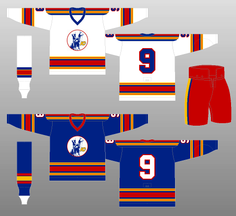
Colorado Rockies (1977-1982)
The Rockies definitely had a jersey that grabbed one’s attention back in the day. The use of bold primary colors immediately draws one’s attention to the jersey’s blue background and prominent red and yellow stripes, and it’s inevitable that one’s focus will eventually shift to the mountainous logo in the center.
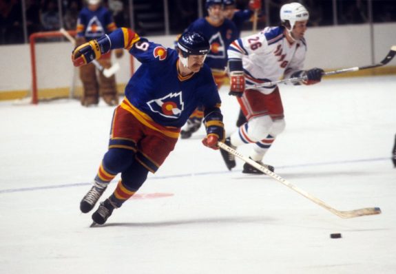
Even though the Rockies were only in the NHL from 1976-1972, they certainly managed to leave behind an unforgettable piece of hockey history as their jersey speaks for itself.
Honorable Mentions
Kansas City Scouts (1975-1976)
When looking at a Kansas City Scouts jersey, the resemblance to the Colorado Rockies’ sweater is eerily similar, and rightfully so as the Scouts moved to Colorado for the 1976-77 NHL season.
Unlike the Rockies’ design, the Scouts’ jersey has a darker blue, red, and yellow shade to it, and a logo showing a Scout riding horseback. While the Scouts might only have been around for two seasons, they provided a nice blueprint for the Rockies to work off of when the team relocated from Kansas City.
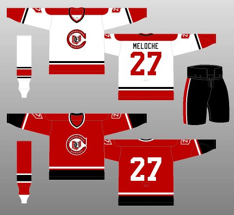
Cleveland Barons (1977-1978)
When the California Golden Seals moved, they became the Cleveland Barons, who eventually merged with the Minnesota North Stars. The crimson red color of the Barons’ jersey makes it stand out and the logo is simple yet to the point. Given the inextricable link between the Seals, North Stars, and Barons, it would be hard to include the former two options without giving the latter a mention.
Be sure to check out NHL Uniform Database for all of your uniform needs, past and present.
Loved those early Oakland Seals’ jerseys. Wonderful use of green, blue, and white. Always wished that the franchise would have made it in No. California, but once they were sold to Charlie Finley, the writing was on the wall. Similarly, the early Minnesota Northstars’ jerseys were great….green, gold, and white with that iconic logo. What a treat. Too bad they added a black accent. As a general rule, I don’t think there was a clunker in any of the 1967 expansion teams’ uniforms.
Solid choices, but I think I still like the older green Whalers jerseys better than the blue revision.
Hey Tom! Thanks for the read and response. I certainly loved the green Whalers jersey. Personally, I don’t know if you can go wrong with any Whalers jersey, but since I had included the North Stars’ green jersey I wanted to spice things up a bit by including the blue Whalers jersey and not “going green” again in the post.
Sweet Jerseys… Love the North Stars Jersey.
Oh yeah, Eric. The North Stars’ jersey might be my favorite one, but the California Seals jersey is definitely a close second.