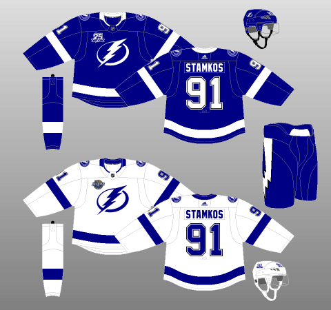
The Tampa Bay Lightning are the envy of the National Hockey League.
They’ve got a phenomenal owner in Jeff Vinik, who put the brakes on disaster and painstakingly rebuilt the organization from the inside out. A former investment wizard, Vinik managed to strike the optimal balance between the fanatical micromanagement of some of his peers, and the utter apathy of others. As a result, the Lightning have been consistently competitive on the ice, and are community fixtures off it.

Their hockey operations are solid, too. Former general manager Steve Yzerman built a strong foundation which current general manager
The fans, for their part, are absolutely fantastic, holding some of the best-looking watch parties in the league just outside Amalie Arena. Inside the building is no different; the atmosphere is absolutely electric. Literally.
In short, the Lightning have everything an NHL franchise could ever want.
Everything, that is, except a decent set of threads.
Lightning Leave Hockey Thunderstruck
The Lightning first took the ice in 1992-93 with some mediocre uniforms about a decade ahead of their time. In an era when bold designs and vibrant
And yet, there were some wacky, wild and thoroughly wonderful features in these original kits.
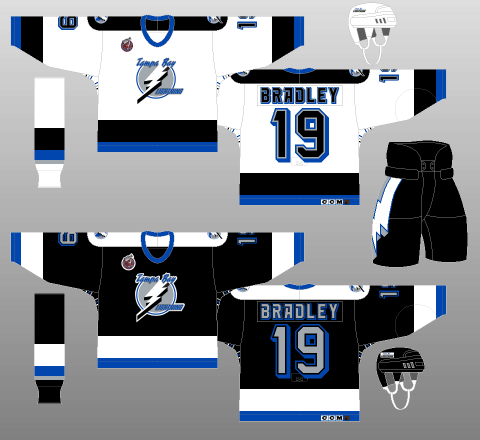
The overall design follows a bog-standard template for a hockey jersey, with shoulder yokes accompanied by horizontal striping on the sleeves and tail.
The primary colours are black and white, with each taking precedent on one of the jerseys while the other occupies the thicker upper part of the striping pattern, as well as the shoulders. The secondary trim colours consisted of blue and silver, the former providing the smaller bottom half of the two-stripe package, along with the colouring for the collar.
Of note, though the two-stripe pattern from the sleeves and tail is replicated inversely on the socks, a third stripe joins them, this one silver and immediately below the others. Why silver wasn’t similarly featured in the jersey striping is anyone’s guess.
As for the logos, the primary crest is a lightning bolt atop a silver circle and surrounded by “Tampa Bay” and “Lightning” wordmarks – in two different fonts, both of which are different from that used for the names and numbers. The secondary crest is similar, simply removing the wording and sliding a blue image of the state of Florida underneath the lightning bolt.
Both of these busy logos have no semblance of artistic sense to them and are better suited to the boot screen of a ‘90s computer game.
The aforementioned jersey font isn’t much better, with the 3D effect from Bristol-board class projects, a typeface straight out of Blade Runner, and the fact the Lightning chose silver, rather than the more legible white, for the character bodies on their dark jerseys. Just when you thought the font couldn’t get any more unhinged, the Bolts told themselves to hold their beer and italicized it the very next season.
One interesting feature is the collection of tiny stripes underneath the arms on the jerseys. Known as “victory stripes,” there are six in total (two sets of three), with two each of blue, silver, and either black or white (whatever contrasts with the jersey background). I don’t really get it. I mean, why would you want something associated with winning stuck underneath your armpits? The only reason I can think of is that they’d show up when a player raises his arms to celebrate a goal or win. Even if that was the intent, the stripes are still spending 99 percent of their time unseen, squashed and overheated in some dude’s sweaty pits.
But perhaps the craziest part of these kits is the lightning bolt down the side of the pants. I’ve always felt the pants an underutilised canvas, with teams generally sticking to simple striping or unobtrusive logos. However, the Lightning did away with convention and slapped an angry-looking bolt on each side. It totally disrupts the otherwise traditional flow of the uniform pattern, yes, but come on, how cool is that?! What an absolutely magnificent piece of design.
Lightning Shock Doctrine Turned up to 11
Three seasons in, the Lightning decided to change their ridiculous font, replacing it with conventional, two-dimensional typefaces. The one for the names is fairly unexceptional – though the names did become arched, but the font used for the numbers (and the captaincy letters) seems to be much the same as that used for the wordmark adorning the top of the primary logo.
Additionally, one year later, in 1996-97, the Bolts debuted their very first third jersey. It’s…it’s something.
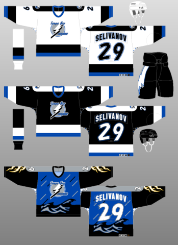
Starting with the home and away jerseys, the new fonts are a significant improvement on the original one, which belonged in a science fiction movie from the 1980s. A simple, plain font makes the nameplates much more legible and, though the numbers are still a little crazy, the 2D design and use of white numbers on the black jerseys helps readability immensely. The numbering looks a bit staticky – even like a frayed wire, a very clever (and legible) representation of electricity, if indeed that was the intent. Interestingly, it appears to be the same font – or, at least, one very similar – to that used in the “Tampa Bay” wordmark above the primary crest.
But then there are the alternate kits. Where to begin…
Basically, the Lightning took everything anyone knew about hockey jerseys, threw it out the window and came up with one of the most bizarre uniforms in NHL history.
I suppose you’d call the primary colour blue, but does this jersey even have a primary colour? Instead of tail striping, there are dark waves, mimicking an angry sea. Instead of sleeve stripes, there are vertical lightning bolts emanating down the arm from the grey shoulder yokes – which I guess are supposed to be clouds? And then there are the thin, short diagonal lines on the front and back of the jersey body, which are intended to simulate rain.
They didn’t even bother designing new socks to go with it! Yes, all this craziness was mounted atop the very traditional socks of the Bolts’ black jerseys.
Oh, but don’t worry, those pesky victory stripes are still there. In fact, even though the jersey is entirely dark-coloured – apparently representing a full-blown thunderstorm, the Lightning made the stripes’ background stark white, adding yet more eye-catching contrast to this thoroughly cringeworthy kit.
You may also like:
- 3 Lightning Defensemen Who Need to Step Up in 2022-23
- Lightning Can Replace Palat, But it Won’t Be Easy
- Lightning Skating Consultants Have Been Key to Team’s Success
- Lightning Could Find Answer To Defensive Needs With Free Agent Target
- Tampa Bay Lightning Jersey History
In fairness to the Lightning, I can see what they were trying to do here. The lightning bolts themselves look absolutely wicked – I’d like to see something like that again, and the blue background would eventually return, free of rain, as a very nice component of an otherwise hateful third jersey. I could even live with the dark, ominous waves taking the place of traditional tail striping. But the grey shoulders – grey is very rarely advisable in any role on a hockey jersey, let alone as a prominent colour – and rain effect are utterly dreadful.
New technology made more complex jersey patterns available to NHL teams thanks to the wonders of sublimation, but this example shows that, quite often, just because you can do something, doesn’t necessarily mean you should. Sometimes, the reason things are the way they are is because they work – and the alternatives don’t.
Tradition Breeds Success for Lightning
For the 2001-02 season, Tampa Bay again made tweaks to their original design, bringing in a very traditional font for both the names and numbers, as well as trading in their blue trim for a slightly darker, more aggressive shade.
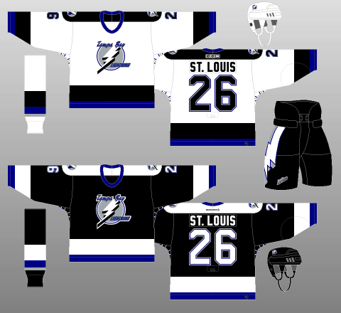
The changes had the effect of dramatically cleaning up the Lightning’s jerseys, putting a crisper, more professional image on a team that had been in near-constant turmoil both on the ice and off it. This simpler styling did raise an issue with regards to the black jersey; all the white contrasts sharply with the near-equivalent amount of black, proving to be rather harsh on the eyes. Should the Lightning have a chance to redo this redesign, I’d imagine they’d get rid of the white shoulder yokes on the black uniform.
One noticeable change is the lack of trimming around the names which, as mentioned, also got a new font. The removal of the trim would have made the names significantly easier to read, particularly from a distance and on television.
A less-beneficial alteration is the addition of a “Tampa Bay Lightning” wordmark logo on the right pantleg. Not only is a third separate logo completely unnecessary, but it also has the effect of making the Lightning’s pants look quite busy, given that they already have lightning bolt striping down the sides (along with, on some models, a manufacturer logo on the left pantleg). These new pants completely disrupt the cleaner, simpler look this redesign seemed to be trying to achieve.
On the whole, this redesign was a success, given that it addressed many of the issues the Lightning kits had had since Day One. That said, in upgrading their professionalism, the Bolts also made their jerseys significantly less interesting. Objectively better, yes. But subjectively… I don’t know, they just ended up looking a little…generic.
Nevertheless, the Lightning persevered and, in 2004, brought the Stanley Cup home to Tampa Bay for the very first time.
Reebok Takes Edge Off Lightning
The Reebok Edge uniform system took hold for the 2007-08 campaign and the Lightning, like most teams, saw their uniforms undergo massive changes. Then, for the 2008-09 season, the Bolts added their second attempt at an alternate kit to their repertoire.
Starting with the home and away jerseys, the Lightning, like so many others, fell victim to the siren song of Reebok Edge.
Gone are the tail stripes, not only making the Bolts’ sweaters look like practice jerseys, but also somewhat washed-out on account of the lack of trim colour to contrast with the background – a particular concern with regards to the black jerseys, given Tampa Bay also chose to go with black pants. As for the sleeve striping, one single band, the opposite colour to the jersey background, lies at the wrist atop what looks to be a medieval bracer extending all the way up the underside – and only the underside – of the arm.
The font is relatively unchanged, with the exception of small jersey numbers being added opposite the captains’ letters on the upper chest, a fad that only the Buffalo Sabres are still clinging to.
The lightning bolt present on both the primary and secondary logos has had its shape and shading altered slightly, and the primary crest has a different font for “Tampa Bay,” with the “Lightning” wordmark being dropped altogether.
The silver accents are gone, as well, leaving only blue and the primary trim color to make up the sock striping. Not only do the socks vary between the home and away uniforms – a gapped two-stripe pattern on the black uniform and a gapped, asymmetrical tri-stripe on the whites, they also taper downwards as they wrap around the leg, never actually joining up, to the frustration of compulsive completionists. Equally ridiculous, a single group of three victory stripes still adorns the armpits.
I do, however, like the upgrade made to the pants, with a vertical blue stripe now backing up the lightning bolt. That said, this very nice design feature seems to fly in the face of the theme of the kit, that of a sleek, modern ensemble. So, not only is the finished product objectively terrible, they can’t even use their theme as a defense, because they didn’t even stick to it!
Lazy Lightning Bolt Door on Good Taste
And then there’s the first iteration of Tampa’s “BOLTS” jersey.
Definitively the most traditional of the Lightning’s Reebok Edge collection, the look features consistent striping on both the sleeves and tail – a thick, black base topped by one white and one silver stripe. The neckpiece is also much-improved, with a very nice black and white two-tone design putting the low-rent collar of the home and away kits to shame.
However, these nice features are spoiled by trying to do too much.
The socks, for instance, have a striping pattern the exact reverse of that of the jerseys which, when worn as a complete uniform with the standard black pants, makes the entire kit look disjointed and disproportional. Why couldn’t they just stick with blue on top and black on the bottom?
Additionally, vertical piping, a Reebok Edge staple the Bolts – wisely – took a pass on for their home and away jerseys, makes an appearance, cluttering up the sweater and making it look cheap.
Other annoyances include a bizarre “Tampa Bay” wordmark – on the back of the jersey, just slapped on the black tail stripe with no real purpose – and the fact the sleeve stripes, just like the socks of the home and away kits, taper off as they wrap around the arm, never meeting on account of the massive black underarm section featuring two sets of, yes, you guessed it, victory stripes.
But the biggest disappointment, by far, is the logo. The standard one moved up to the shoulders, creating a beautiful blue backdrop for a new alternate primary crest – or even the use of the shoulder patch they already had. Those would be logical approaches.
So, what did we get instead? A diagonal BOLTS wordmark.
First of all, regarding diagonal wordmarks: unless you’re a team like the New York Rangers or the Pittsburgh Penguins, teams that have long histories of using such wordmarks in lieu of a crest, making use of this design choice is thoroughly tacky – and, even worse, boring.
Not to mention it’s downright lazy. It’s lazy for any team, but the Lightning? Come on. When your franchise is named after one of the most breathtaking and terrifying events on Earth – one which leaves onlookers simultaneously frightened and in awe, you should have all the inspiration in the world to design something unique and meaningful.
Instead, we got BOLTS, a cop-out devoid of all majesty and emotion.
Tampa Bay Somehow Manages to Make Lightning Boring
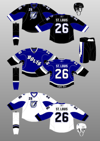
In 2011-12, the Lightning debuted new home and away jerseys, keeping the blue alternate sweaters in the rotation (neglecting to update the third jersey’s shoulder patches to the new logo for the first season). For the 2014-15 campaign, the blue thirds were retired in favour of a new black alternate kit.
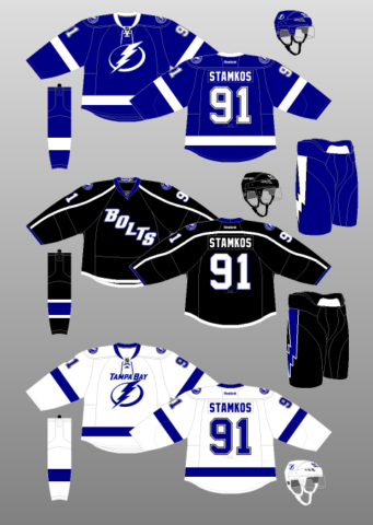
Starting with the home and away kits, they’re just…well…a bit boring.
There’s nothing explicitly wrong with these new kits; objectively, they’re actually quite good. A single, thick contrasting stripe – white for the blue jerseys and blue for the whites – adorn the tail, sleeves and socks, while a contrasting lightning bolt acts as a vertical stripe on the pants. Even the collar is a contrasting colour, including the tie-down. Very good attention to detail, that.
On the surface, then, they seem like the simple, solid, traditional uniforms any organization would be proud to call their own.
However, for a team called the “Lightning,” there’s just…well…not a whole lot there.
The centrepiece of the redesign is a suite of new logos. The primary crest looks like what the Flash would use if he left his DC comrades to start a courier company, rather than evocative of one of nature’s most destructive and deadly forces. The shoulder patch is much the same, only with a roundel reading “Tampa Bay Lightning Hockey Club” surrounding the stylized bolt. Of note, a “Tampa Bay” wordmark joins the new primary logo on the white jerseys.
There’s no excitement in anything. The logos feel corporate. The design feels like it’s straight out of “Create-A-Team” mode. The colour scheme isn’t very aggressive, with black being relegated to trimming the jersey numbers and pants.
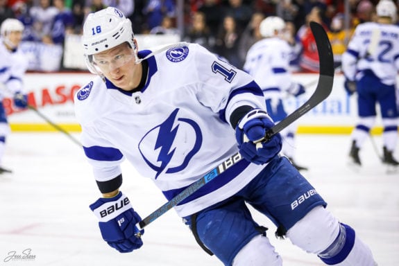
plain look. (Jess Starr/The Hockey Writers)
I don’t know how a team named the “Lightning” managed to come up with something so utterly boring – devoid of all happiness and enthusiasm, but, credit where credit’s due, they did it. Tampa Bay, somehow, managed to make lightning boring.
Lightning Keep Using Bolts
And then we have the second iteration of the BOLTS jersey.
Earlier, I called Tampa Bay’s use of the BOLTS wordmark logo “lazy,” and I stand by that. However, this alternate kit not only uses the same, lazily designed logo, but the product as a whole is downright inexcusable.
There’s no striping to speak of, save for a thin bit of white trim on the bottom of the tail, and a blue one on the cuffs of the sleeves. Look up to the shoulders and you’ll see the Lightning’s secondary logo – they couldn’t even be bothered to use their primary crest – surrounded by a swooping, uneven shoulder yoke (ripping off their cross-state rivals the Florida Panthers) that extends the full length of the arm.
Well, when I say “shoulder yoke,” it’s actually just two white lines surrounded on all sides by the black of the jersey’s background.
Outside of the terrible logo, all the black is the worst thing about this kit. On the sweaters, the only spots of blue, supposedly the team’s primary colour, are found on the ends of the sleeves, trimming the letters and numbers, and on the Walmart-grade collar.
And yet, it clearly didn’t have to be this way. After all, the socks have a conventional slim-thick-slim pattern, with plenty of blue to compensate for the black background, and the black pants have a blue-coloured lightning bolt. Both of these design choices work really well, so why did the jersey miss out?
A black sweater with a lightning-related logo should have been a tap-in for Tampa Bay. However, they fumbled the design on the way to the open net…
ADIZERO Further Stifles Lightning
Despite the advent of the new
Not much of note here, though I will say the Lightning did one of the best jobs in the league with regards to the ADIZERO collar.
Even though they got rid of the lace-up feature (which isn’t actually functional on ADIZERO jerseys), the Bolts’ neckpiece still retains its contrasting color. More importantly, where the collar splits into two sections towards the front, Tampa Bay decided to only color the inner ring. This keeps the players looking sleek and sharp, rather than like they’re wearing a thick, burdensome horse collar like some other teams.
Lightning Disrupt the Night
With news of a third jersey coming in 2018-19, Lightning fans waited anxiously while speculating about what the jersey could be. Would it be a throwback to the insanity that was the 1996-97 third jerseys? Would it be all black? Would there be victory striping?
It took until Feb. 7th before fans would get to see their new jersey. When the reveal finally happened, the general reaction was a bit mixed.
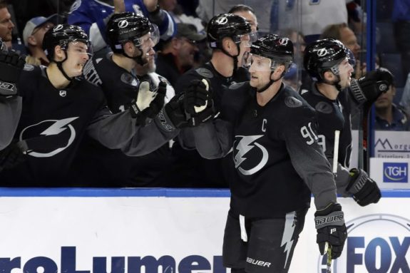
While sporting the Lightning’s primary logo on a traditional black jersey, the new third jersey took a different approach to the sleeves. As said by Chris Creamer of sportslogos.net:
The jersey base is black with sublimated raindrops on the sleeves, socks, and numbers
These sublimated raindrop sleeves were designed to catch the eye of the younger generation. They have been successful at this venture, as the new jerseys have sold well and have generated a lot of discussion around the franchise.
So, while they may not be for everyone, they have already established a cult fanbase in Tampa.
Lightning Jerseys Need Recharge
Tampa Bay is an established, successful hockey market that has shoved concerns about hockey in the Sun Belt right down their detractors’ throats. They’ve done just about everything right, which is why it’s so perplexing they’re content to trot out some of the most boring, uninspired uniforms in sports.
The thunderstorm jerseys – and even the palm tree-laden gag sweaters – are pretty hokey but, hey, at least they’re interesting!
Any type of art, especially commercialized art – hockey jerseys included, should seek to evoke some sort of emotion in its audience; some sort of sense of pride and meaning and inspiration. Unfortunately, despite adorning the bodies of a team called the “Lightning,” Tampa Bay’s uniforms don’t do any of that.
The Lightning are in desperate, desperate need of a recharge.