With all due respect to the bustling metropolises of Glendale, Arizona and Ottawa, Ontario, the National Hockey League has not set up shop in a truly iconic city anytime in recent memory. So when Las Vegas was granted an NHL franchise last June, it was new territory for the notoriously conservative league.
What to Call a Team in Vegas
Lawyers Ruin Vegas Fun
After all, they couldn’t possibly give the team a name that had anything to do with gambling. Which is fair enough; I mean, it’s not like the NHL is sponsored by a fantasy sports megalith or anything.
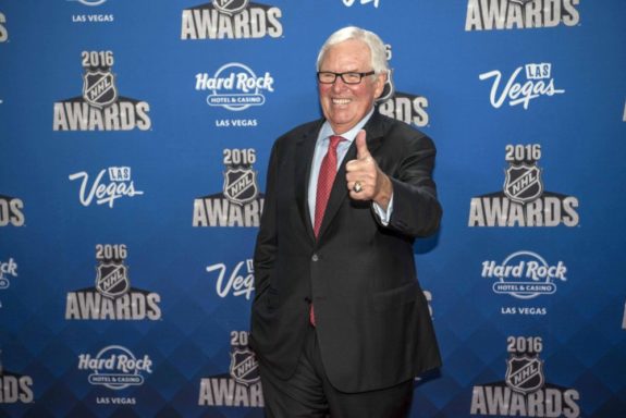
Team owner Bill Foley was pushing for “Black Knights,” on account of his connections at West Point. However, even those connections weren’t enough to overcome the restrictions of trademark law. I guess $500 million just doesn’t buy as much as it used to…

The team couldn’t use the more generic “Knights” moniker, either, as the Ontario Hockey League’s London Knights somehow have a Canada-wide monopoly on it, thereby preventing any NHL team from using it. “Desert Knights” was also considered although, come on now, no one in their right mind was ever going to call them that.
Golden Knights’ Trademark Troubles
Even now, the agreed-upon name, the Vegas Golden Knights, is still not trademarked, having been refused designation by the United States Patent and Trademark Office (USPTO). Apparently, some schools no one’s ever heard of use the Golden Knights (or similar) name, and goodness knows ticket-buying fans might confuse their desire to go to an NHL game in Las Vegas with their (inexplicable) desire to visit central Florida or Albany, New York.
I make a March Madness bracket every year. Now, I know exactly zero about college basketball, but why are so many teams allowed to be called the “Bulldogs?” And how about the “Wildcats?” If the trademark issues raised by the Golden Knights name are indeed the rules, how did these two names come to represent a combined 87 percent of National Collegiate Athletic Association teams?
Complicating matters further, the United States Army’s Parachute Team is also named the Golden Knights. And even though they haven’t felt the need to trademark the name since its first use in 1962, the Army also decided to make a fuss.
This all seems like a lot of hassle to go through for a team everyone’s gonna end up calling the Knights, anyway.
Vegas Golden Knights Logo
Understated Elegance for Vegas
Finer points of trademark law aside, the Golden Knights are the Golden Knights for the time being, so let’s get to their logo. It was revealed in a spectacular tire fire of a ceremony back in November, complete with technical difficulties and the ever-personable Gary Bettman heckling the crowd.

I have to tell you, I was worried when the Golden Knights name was first rumoured; really, I was worried about any variation of Knights being used. After all, the first major-league professional sports team in a city as synonymous with glitz and excess as Las Vegas might be tempted to go way over the top and trot out some cheesy, over-produced, Medieval Times-esque crest. Mercifully, this was not the case.
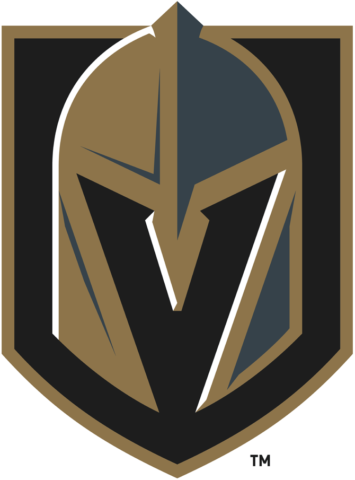
Initially underwhelming, the Vegas logo has grown on me as I’ve come to appreciate its subtler aspects. The helmet motif features a gold and steel grey colour palette on a gold-rimmed black shield. These colour choices, along with the aggressiveness of the helmet itself, promote a firm and forceful, if somewhat gloomy, image.
The helmet is not overly complicated in design, nor does it feature excessive detailing. In fact, on the actual jerseys, it is the black shield-like backing that steals the show, with some subtle, tasteful, medieval manuscript-type flourishes framing the crest. Additionally, while not quite at Hartford Whalers levels of ingenuity, the use of negative space in the helmet design to form a “V” is a very nice touch.
Up close and personal. #VGKFirstJersey pic.twitter.com/EF9CbFHa4i
— Vegas Golden Knights (@GoldenKnights) June 21, 2017
Golden Knights’ Missed Opportunity
The longer I stare at the Vegas logo, the more it becomes eerily intimidating. Are those ridges in the helmet or angry eyebrows? Does it have a mind of its own? Just who lurks behind this ghostly helm? In a way, this crest is a representation of the very idea of Las Vegas; a tantalising cacophony of glamour and opportunity, all within plain sight and yet, somehow, someway, just out of reach. An elusive, ghostly mirage in the desert, the pursuit of which will consume your soul…
However, as mentioned in my review of the Vegas uniforms as a whole, the darkness and simplicity of the Golden Knights logo is not well-complimented by the colour choices on the home kit. Using steel grey as the primary colour makes for a drab and dreary jersey. Being eerie and intimidating is one thing, but this uniform turns a mysterious helm into a depressing pile of thread.
Using red as the backdrop would contrast greatly with the crest’s subdued hues, making the logo really pop off the chest. Such contrast is used to great effect on the road whites, which are a huge improvement on the home kits.
Vegas Golden Knights Secondary Logo
Vegas’ alternate crest is the polar opposite of its big brother. Bright, flashy and straightforward, the eight-pointed star seems to be lifted straight from the iconic “Welcome to Fabulous Las Vegas, Nevada” sign.
For the people who do not understand why the secondary logo is incredible. Look… pic.twitter.com/s40GF8KAWo
— SinBin.vegas (@SinBinVegas) November 23, 2016
Two crossing swords represent the intercardinal directions of the star, though it is curious that they are pointing downwards. This orientation, to the layman at least, suggests the sheathing, even relinquishment of the weapons, rather than the warrior mentality the team name suggests. As such, I would like to see this crest altered so that the swords point upwards.
On the whole though, the secondary logo works extremely well as a shoulder patch. However, should Vegas ever decide to introduce a red jersey as a canvas for the helmet logo, either as an alternate or replacing the home greys, I would like to see this secondary crest get a shot at primary duty on either the grey or the white uniform. I feel as though the red and gold which dominate the alternate logo would contrast well with the white and grey – especially the grey – backgrounds.
Golden Knights Got It Right
If the Vegas franchise has learned one thing in its infancy, it’s that nothing is ever easy in the NHL. That said, they aren’t exactly helping themselves out; their response to their trademark denial lists the team name as the “Las Vegas Golden Knights.” Come on, guys.
At least they got the logo right. Despite the Golden Knights moniker, Vegas didn’t go cartoonish and they didn’t go full history buff. The haunting image of that simple, striking helmet crest really does have the potential to become ingrained in the minds of hockey fans forevermore. Of course, that is all dependent on the team finding some success in the desert. Time will tell if the Vegas franchise is truly gilded, or just a pile of fool’s gold.