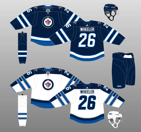
Since the Winnipeg Jets returned to the National Hockey League in 2011-12, their jerseys have remained exactly the same.
Certainly, uniform continuity is welcome in some instances; who among us hasn’t scrimped and saved for the sweater of our favourite team, only to see them change the design six months later?
However, though I respect the Jets’ intentions with regards to their comeback threads, the quirks and complications of their current kits are beginning to wear rather thin.
Jets’ Jerseys Turbulent From Takeoff
As I mentioned in my write-up of the Jets’ aesthetic history, Winnipeg’s current ensembles seem to represent 15 years worth of frustration and design ideas poured into one output.
Related: Everything You Ever Wanted to Know About the Jets’ Jerseys
The result is a uniform set featuring far too many conflicting design features, while at the same time managing to be drab and dreary, thanks to poor use of an otherwise very solid colour palette.
Jets Can’t Bring Back the Past
Winnipeg’s new branding seems to signal the franchise’s desire to break with the past, with few tributes paid to either the WHA or NHL days of the Jets’ first flight.
I can respect the franchise’s rationale on this point; after winning the Avco World Trophy three times in the WHA’s seven seasons, the Jets only made it past the first round of the NHL playoffs twice – and were promptly swept on both occasions.
In addition to the original Jets’ lack of on-ice NHL success, their long, drawn-out decline and eventual departure to Phoenix was no doubt tortuous for one of the league’s most dedicated fanbases.
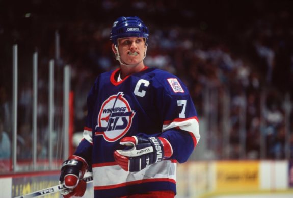
Twisting the knife even further, fans of the original Jets were forced to watch as, though the Phoenix (now Arizona) Coyotes hemorrhaged money year after year, the NHL, time and again, would bail out the shambolic organisation (something it continues to do, to this day).
Thus, I’ve focussed on working within the confines of the Jets’ current branding, rather than simply bringing back one of their old designs. The occasional throwback sweater would certainly be more than welcome but, in terms of the team’s day-to-day jerseys, it’s probably better to stick with the new direction.
Winnipeg Jets Home Jersey Concept
Taking inspiration from old Royal Canadian Air Force teams – including the 1948 Olympic gold-medallist Ottawa RCAF Flyers (from which the Jets’ current logo is derived), I’ve gone with a light (lighter than the Jets’ current lightest shade, known as “aviator blue”), almost powder-blue backdrop for the Jets’ home uniforms.
Many teams have tried a light blue ensemble – including the predecessor of the Jets 2.0, the Atlanta Thrashers – with varying degrees of aesthetic success. However, I believe Winnipeg’s bright, sharp, aggressive colour palette helps makes the shade a winner.

Along with the inclusion of a lighter shade of blue, you’ll notice red is far more prominent in this proposed ensemble than in the current iteration of the Jets’ jerseys, with a corresponding reduction in role for the darker, “polar night blue.” This new colour balance is not only pleasing to behold, it really helps the Jets’ already thoroughly respectable logos to pop.
On the sleeves, tail, pants and socks, I’ve gone with a streamlined version of the new Jets’ dual-stripe pattern, free of the trimming and other encumbrances they’re currently saddled with. The pants were inspired by those of the Jets’ brilliant alternate kits worn in the 2016 Heritage Classic.
The colour distribution of the striping package – that of light colouring above the dual red stripes, with dark in between and below – draws inspiration from the template (though not the colour palette itself) of the expansion Ottawa Senators.
Finally, I’ve opted for a more traditional typeface than that which the Jets use now. Currently, Winnipeg makes use of rounded letters and numbers (the latter italicised) which, while futuristic and indicative of jet-like movement, really takes the edge off the kits – and not in a good way.
Winnipeg Jets Away Jersey Concept
The proposed white road jersey shares the exact same template as the home, save for the addition of polar night blue shoulder yokes to balance out the white backdrop.
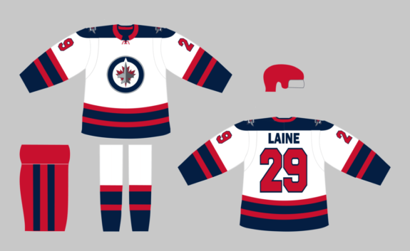
Of note, you’ll notice the red helmet has been carried over from the home design, a feature which I’m not entirely sure would stand up to NHL scrutiny if worn on the road. It’s not a dealbreaker for the uniform, however, as the outfit would look very nearly as nice if topped with a white bucket.
Winnipeg Jets Alternate Jersey Concept
I’m not going to touch this one, as the Jets already have a perfectly good third jersey in their back pocket.
For the 2016 Heritage Classic against the Edmonton Oilers, the Jets rolled out a spectacular number that combined the very best design elements of their WHA days to create one of the finest NHL sweaters in recent memory.
IT'S HERE! We are excited to unveil our 2016 Tim Hortons @NHL #HeritageClassic jersey! #GoJetsGohttps://t.co/kR17OEnwg4
— Winnipeg Jets (@NHLJets) August 5, 2016
Even if the WHA-inspired throwbacks don’t reappear, the Jets’ NHL-era back catalogue contains four other beauties – the home and away kits of both their previous NHL uniform sets. Winnipeg is fortunate in this regard; whatever they end up choosing for their new third jersey, they can’t really go wrong, provided they stick to what’s worked in the past.
That said, they could well decide to do away with tradition and concoct something completely new. While the Heritage classic alternate sweater would be a guaranteed success, anything else would be a complete crapshoot.
Jets Have Every Opportunity to Succeed
The Jets’ current uniforms really only appeal to their fans. The brighter, simpler, more coherent design above would appeal not only to Jets fans, but also the multitudes around the world simply searching for something that looks cool.
In one fell swoop, the Jets could rocket themselves into the NHL’s aesthetic elite.
(Logos and colours sourced from Chris Creamer’s SportsLogos.Net and ColorWerx, respectively.)