The Winnipeg Jets have always been a bit of an odd bunch in the aesthetics department.
Their World Hockey Association days saw them change their uniforms nearly every single year. Once they reached the National Hockey League, they wore a stolen jersey template for an entire decade. The return of the Jets to Winnipeg in 2011 saw 15 years of pent-up ideas crammed into one design. And, despite a glorious back catalogue to draw from, the third sweater introduced for 2018-19 contains no imagination or appeal whatsoever.
Related: Everything You Ever Wanted to Know About the Jets’ Jerseys
However, the centrepiece of Winnipeg’s ensemble, their logo, has almost always been a triumph, providing us with some of the most beloved imagery in NHL history.
The Jets Wordmark
The Jets made their WHA debut in the league’s inaugural season of 1972-73, taking their name from the Winnipeg Jets of the Western Canadian Hockey League (now the Western Hockey League). The “Jets” name seemed appropriate, given that Winnipeg is host to the Royal Canadian Air Force’s Canadian Forces Base Winnipeg. What sealed the deal was owner Ben Hatskin’s fandom of the New York Jets.

Regardless of the origins of the moniker, Jets is an excellent choice for a sports franchise. The noise, power and explosiveness of the jet, combined with the vivid imagery of military planes engaged in combat, form an aggressive, energetic, overpowering brand perfect for the blindingly fast, excruciatingly tough sport of hockey.
Unfortunately, the Winnipeg franchise didn’t get the memo.
Wordmark logos are a tough sell at the best of times but, come on now, how on Earth do you not do more than this when you’re named the Jets? It’s not like the Minnesota Wild, for example, who have a mysterious, ambiguous name difficult to attach any imagery to.
The string is jauntily angled upwards from left to right, and features a blurring effect on the “t,” the lone indication of any jet-related content in the crest.
The “J” is shaped in such a way as to represent a hockey stick, with the blade supporting an image of a hockey player in flight – just in case you forgot who plays the sport you’re watching.
I don’t know exactly why, but the typeface as a whole bothers me. I just don’t think the letters are properly proportioned, especially the “e” and “s.” Something just looks off.
Really the only redeeming feature is that the Jets created two separate versions of this logo – one for their white sweaters and one for their blues.
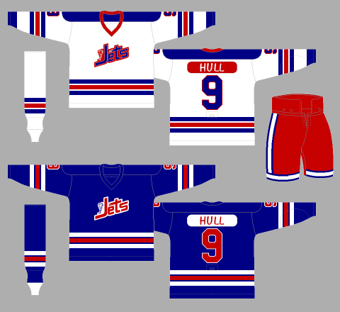
The resulting effect is very much for the better. Had the Jets only used the white jersey’s emblem, which features blue text with red trim, the crest would have looked utterly dreary and washed out on the blue jerseys. Likewise, the dual use of the blue uniform’s logo, that of red text with white trim, would have made the white uniform’s jersey front just a little too sparse.
Why am I spending so much time on this seemingly trivial point? That will become clear momentarily.
The Winnipeg Jets Roundel
Mercifully, the Jets’ wordmark logo only lasted a single campaign, with the team overhauling their entire look for their second season.
Included in said overhaul was a brand-new primary crest, which was a marked upgrade over the original.
The logo is round, composed of a blue backdrop trimmed in red. The inside of the roundel features a stylised, italicised, funkified “WINNIPEG JETS” wordmark, flanked by an image of a jet.
The best part about this new crest, by far, is the creative use and balancing of colour. The “WINNIPEG” and “JETS” of the wordmark are red and white, respectively, while the jet itself, while the same colour as the logo background, is in its own red bubble.
The J in JETS has been made even more like a hockey stick, and appears to be cradling the jet’s red bubble – a puck. That’s some excellent design, right there.
You may also like:
- 2022 NHL Free Agency: Best Restricted Free Agents Remaining
- NHL Rumors: Devils, Flames, Jets, Canadiens
- Pierre-Luc Dubois Has Jets & Cheveldayoff in a Bind
- Jets & Canadiens Could Produce Blockbuster Trade for Dubois
- NHL Rumors: Flames, Maple Leafs, Sharks, Jets
These small, subtle elements take this logo from merely good to unquestionably timeless.
It’s not without its faults, however. Not only are the two parts of the wordmark in two different typefaces, their arrangement leads the eye to read “JETS WINNIPEG.”
Next, the angling of the jet image almost makes it look more like a rocket ship than an airplane.
But by far the most disappointing component of this redesigned logo is just that – that there’s only one logo.
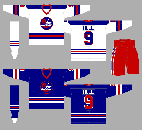
The new emblem looks spectacular on the white uniforms, but its blue background washes in with the blue backdrop of the Jets’ dark jerseys, minimising its overall effectiveness. This lack of contrast is not only detrimental to the logo, but also the kit as a whole, rendering it rather dull and dreary.
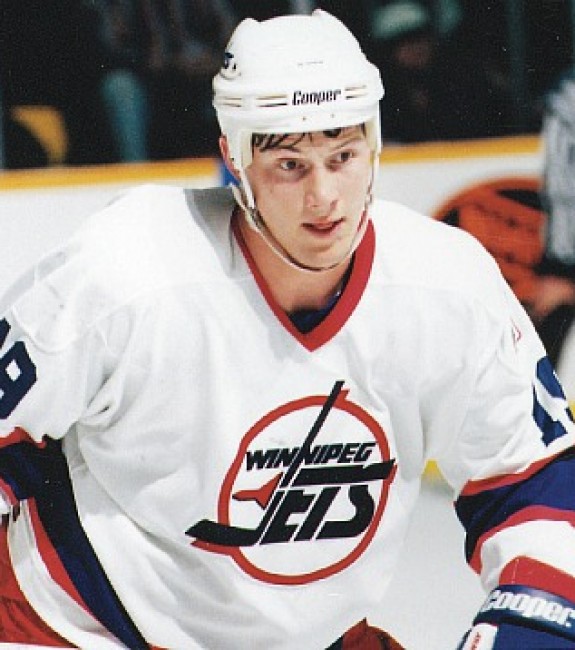
Thankfully, accompanying the Jets’ entry into the National Hockey League in 1979-80 was a white-based logo for their dark uniforms.
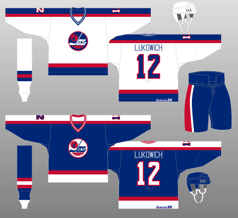
As you can see, the improved contrast really helps balance these Winnipeg kits out, providing the league with one of the all-time great uniform sets.
It wouldn’t be too long, however, before the Jets repeated their previous mistake.
The Winnipeg Jets Roundel: Version 2.0
From the 1990-91 season until their move to Phoenix following the 1995-96 campaign, the Jets sported the second edition of their roundel emblem – a much-improved version of an already grand design.
This time, the background of the crest is white, while the red trim has been retained. The WINNIPEG JETS wordmark has been rearranged and streamlined, while the jet has been turned on its side. Most strikingly, the components of the crest seem to be spilling out the sides of the roundel.
Starting with the wordmark, the fact it now reads WINNIPEG JETS instead of JETS WINNIPEG is a definite improvement, while the typefaces for each word now appear to be the same – also good, with a more modern design, to boot. The stem of the J is the first stroke of the second N in WINNIPEG, further unifying the logo’s wordmark.
One interesting theme to this crest is the illusion of movement. The jet, though now turned on its side and looking even more like a rocket – or even a bomb or missile, appears to have streaked through the JETS part of the wordmark, leaving a sort of contrail behind, separating the tops of the letters from their bodies, à la “Blade Runner.”
Further movement is indicated by the fact the design now seems to be bursting out of the roundel, breaking the circle at three points. The crest also now has a three-dimension element to it, thanks to drop shadows on each of the protruding parts.
These are all subtle improvements, but they all add depth and meaning, taking the look to a whole other level.
Again though, the Jets only brought out a single crest.
The white-backed logo looks wonderful on the updated blue jerseys, but comes dangerously close to washing out the white kit entirely. Making matters worse, unlike the last time, the Jets never bothered correcting this major flaw in their aesthetics.
The Jets rolled out another classic logo design for 1990-91 which fronted another classic uniform template. Unfortunately, they also made another bewildering decision with regards to how to combine these two new elements, and the resulting kits are worse for it.
Winnipeg Jets Current Primary Logo
The Winnipeg Jets 2.0 began play in the 2011-12 season, sporting version 3.0 of the roundel crest.
The Winnipeg Jets Roundel: Version 3.0
The logo is essentially the RCAF roundel with a fighter jet – finally, a realistic-looking one – atop the red maple leaf at the centre of the design.
The use of the RCAF emblem is a tribute to the Ottawa RCAF Flyers, who wore said logo proudly on their chests en route to winning the gold medal at the 1948 Winter Olympics. (from ‘Jets fly with air force logo,’ Winnipeg Free Press, 07/23/2011) There is no more wordmark to speak of, and both the jet and the roundel’s trim are silver.
Of note is the shading effect used on the jet and maple leaf. The use of light and dark, side by side, makes the crest look dark and subtly aggressive. When this shading strategy is combined with the silver trimming of the logo, the overall effect is that of some sort of metal, perhaps signifying steely resolve or, more literally, a tough team to play against. The fact there’s an actual fighter jet in the picture only adds to this impression.
One thing that’s decidedly missing is the impression of movement, which this logo’s predecessors incrementally strove towards. And yet, this crest is implemented so nicely that it almost immediately commands reverence, without any need to convey any message or hammer home any point.
Like the emblems of the original Jets (excluding that which was worn during their inaugural campaign), as well as other classic crests from across the NHL, Winnipeg’s current logo is a case of a good design made exceptional by attention to detail.
Winnipeg Jets Current Secondary Logo
Also in 2011-12, for the first time in their history (histories?), Winnipeg added a secondary logo to their aesthetic ensemble
Winnipeg Jets Get Their Wings
Like its primary counterpart, this shoulder patch is also rather nice, though a little busy. It’s composed of a set of pilot wings (an aviator badge for you aeronautical aficionados – or, more specifically, given this is a Canadian team, an aircrew badge) backed by a pair of crossing hockey sticks, and fronted by a WINNIPEG JETS wordmark and a red maple leaf.
There’s certainly a lot going on here, but I’m not quite sure what you’d take out. The wordmark frames the logo nicely. The red maple leaf provides continuity with the primary crest – even shaded identically, to boot. And the hockey sticks are helpful, reminding everyone that, no matter how much we might like to believe it, the Jets are a hockey team, something that has literally nothing to do with serving one’s country.
In contrast to the relative simplicity of the Jets’ primary crests throughout their history, this secondary logo is quite complex. That said, like its primary counterparts, it’s a collection of elements that just sort of…works.
I can’t quite explain it, but the Jets 2.0 have done a very good job with making both their logos modern, yet classic; simple, yet interesting; objectively sufficient, yet subjectively great.
Winnipeg Jets Current Primary Alternate Logo
But, before you go giving them too much credit, the Jets’ designers made a dandy of a dud with their first attempt at a third jersey, including this spectacular flop of an alternate crest.
The Jets Wordmark: Version 2.0
Ahead of the 2018-19 campaign, the Jets unveiled their first-ever full-time alternate kit. It’s pretty awful, if we’re honest.
Most awful of all, however, is that horrid logo adorning the chest, a white Jets wordmark written in a handwriting-like script and trimmed in the team’s polar night blue.
The colouration of the crest looks pretty sharp atop the aviator blue backdrop, but that’s about the limit of my praise for this design.
Straight up? It’s boring. I generally view wordmark-only logos as cop-outs to begin with, but this one is especially so. None of the design features of previous Jets wordmarks – the stand-alone crest as well as those embedded within the roundel designs – appear to have been incorporated. The J isn’t a hockey stick. There’s no contrail through the letters. There’s not even the blurring effect of Winnipeg’s inaugural emblem.
The team claims, “The new wordmark and logo includes a Jets script that draws from a long line of team wordmarks that have incorporated Jets shapes and motion.”
I’m sorry, but I just don’t see it. I don’t see much of anything, to be honest.
To make matters worse, this lone wordmark isn’t backed up by anything on the shoulders, further isolating an already disappointing design.
The team also notes the logo “is highlighted with the “t” in “Jets” being crossed with the outline of a fighter jet.”
That’s actually a very nice touch. I like it a lot. I’d like it even more if it didn’t have to be explained to me. With the Hartford Whalers’ logo or, more recently, that of the Vegas Golden Knights, these subtle design features are hidden in plain sight, available to any and all with the right perspective.
In contrast, were it not explained in the press release, the crossing stroke would simply have looked like just that, a crossing stroke, until the end of my days.
Now, this isn’t to say the logo’s creator should be in any way criticised for his work. The team obviously had a plan in mind, and his job was likely just to execute that plan as best he could.
The sad part is, if they were so hell-bent on using a wordmark design, why didn’t Winnipeg just update one from their past? Even though a wordmark-only crest would have been a disappointment, at least it would represent the team in some way.
This logo is as dull and generic as they come, utterly indistinguishable from something you’d see in your beer league.
Turbulence Doesn’t Spoil Jets’ Flight
That said, no one gets it right 100 percent of the time.
As such, we should all remember that the Jets have gifted us three of the best primary logos in the history of the NHL. At any point in time, they can reach back into their history and repurpose an older design that’s sure to be a hit (as they did for the 2016 Heritage Classic).
And yet, based on their 2011-12 re-entry uniforms and their 2018-19 alternate unveiling, they seem bound and determined to leave their past behind and strive for something new – something better.
And you know what? Even when it doesn’t work, that’s a commendable attitude to have, it really is. In the words of Oliver Cromwell, “He who stops being better stops being good.”
I can think of no better quote to reflect the Jets’ historic attitude towards logo (and overall uniform) design. They’re constantly looking to get better, so that they may remain one of the best.
Yes, Winnipeg’s had the occasional failure in the logo department. But there’s been nowhere near enough turbulence to spoil their smooth, spectacular aesthetic flight.