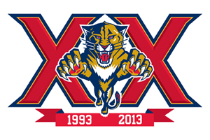
Coming off a rather lackluster campaign, and existing in a market that cares more about other sports much more than hockey, the Florida Panthers will try anything to ensure the fans return next season. The upcoming NHL season will be the 20th anniversary of the hockey club’s entrance into the league and the team has come up with a new commemorative logo:

While the logo may be considered nothing special to some, others believe that it’s just right – not too flashy nor a complete overhaul of what the fans have come to know and love, and it presents a statement of commitment from the organization.
The club has been around for 20 years and is planning on sticking around. Just like the message the team is working hard to convey to its fan base (as well as itself): that we didn’t make it 20 years in a beach state which barely knows what hockey is by giving up. We had a stellar 2011 season followed by a crappy 2012 one. But it’s 2013 now, and we’re 20 years old, and we’re growing up.
Ok, that may be a bit of a stretch, but it could also be a huge motivating factor behind the presentation of this logo, specifically now, right before the draft where the team holds the 2nd pick, and is hoping to have a very positive offseason. The draft could be a way to build a team that will lead the club into the next two decades with a lot more positive outcomes.
Or, fans could be excited about the new logo because of how much it reminds them (rightly so) of this certain alcoholic beverage…and just imagine Panthers’ GM Dale Tallon in a commercial, holding a beer saying something like: The Panthers don’t always win the division, but when we do, we finish last in the conference the next year. Or how about: I don’t always watch hockey games, but when I do, it’s a Panthers game. Someone make that a bumper sticker!
It’s a pretty sleek logo, and the bold X’s give it a powerful feeling of a positive explosion into this anniversary year. This won’t be “just another season” as the Panthers are hoping to turn everything around. Will the logo be a sign of a turn in the tide in Florida? Or is it just a scheme by the organization to try and hold onto the fans that are exiting quickly after last season’s rough showing? Only time will tell.
just as Jeff answered I am in shock that anybody can make $9828 in a few weeks on the internet. did you look at this web site>>http:\tinyurl.cℴmqz55bal.
just as Jeff answered I am in shock that anybody can make $9828 in a few weeks on the internet. did you look at this web site>>http:\tinyurl.cℴmqz55bal.
just as Jeff answered I am in shock that anybody can make $9828 in a few weeks on the internet. did you look at this web site>>http:\tinyurl.cℴmqz55bal.
I get paid over $90/h for working from home with 2 kids at home. I never thought I’d be able to do it but my best friend earns over 12k a month doing this and she convinced me to try. The potential with this is endless. Here is what I’ve been doing>>http:\tinyurl.cℴmqz55bal.
I get paid over $90/h for working from home with 2 kids at home. I never thought I’d be able to do it but my best friend earns over 12k a month doing this and she convinced me to try. The potential with this is endless. Here is what I’ve been doing>>http:\tinyurl.cℴmqz55bal.