A Mix of Skill
The San Jose Sharks defense has had a number of excellent players in their history, such as Dan Boyle, Marc-Edouard Vlasic and Sandis Ozolinsh. At the same time, however, they have had some defensive duds, like Jeff Jillson, Niclas Wallin and the second stint of Scott Hannan. The Sharks’ blue line has always been a mix of elite and below-average players.
This season is no different—what else would you expect in the salary cap era? While some players may be more skilled in different parts of the game, there is no doubt that some defensemen on the roster are better than others.
By using data from War On Ice, we will analyze the talent in San Jose’s defense corps by looking at a number of mainstream and advanced statistic comparisons. The players under the microscope are Vlasic, Justin Braun, Paul Martin, Brent Burns and Brenden Dillon.
*All data used consists of totals over the past five seasons.
**All statistics are at even strength, score close (game within one goal)
The Data
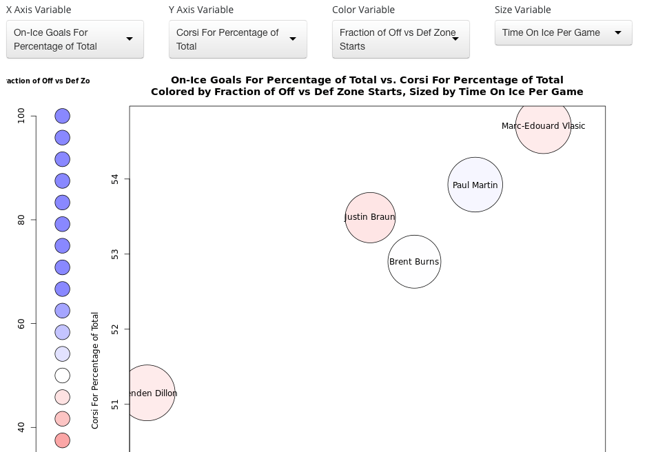
Graph One: Goals-For vs. Corsi
How to Read the Graph
This graph is visualizing data by using the x-axis to show a player’s goals-for percentage and the y-axis to plot their corsi-for percentage. The higher up they are, the better their corsi; the farther to the right they are, the better their goals-for. The strongest player in both categories will be on the top-right corner of the graph.
The color of the dot is determined by a player’s zone start percentage. A player’s dot will appear red if they start more shifts in the defensive zone or blue if they are deployed in the offensive zone. A redder color typically equates to a tougher situation.
Finally, the size of the dot demonstrates the player’s average time on ice per game. Larger dots mean more ice time and vise-versa.
Graph Conclusion
Vlasic is the strongest person in these metrics without a doubt. When he is on the ice, San Jose is able to generate shot attempts and convert on their opportunities at a higher rate than their opponent. This is made even more impressive by the fact that he begins most of his shifts in the defensive zone.
Braun, Martin and Burns all sit on respectable spots on the graph, as they have positive possession and goals-for numbers.
Dillon, however, is fairly weak compared to his teammates. He holds a slightly positive Corsi, but is actually negative in the goals-for category (though the number is not shown). It is worth noting that he has played with less-than-stellar partners in the NHL and starts primarily in the defensive zone. Still, he is the weakest blueliner by far in this situation.
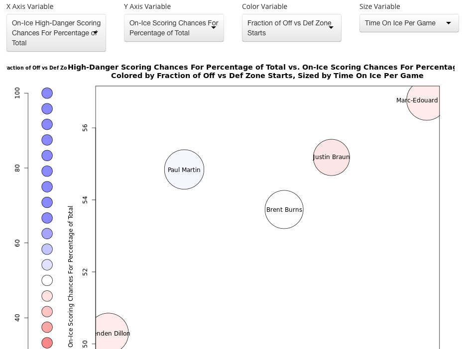
Graph Two: Scoring Chance Comparison
How to Read the Graph
In this setup, we are analyzing scoring chance differential on the y-axis and high-danger scoring chance differential on the x-axis. Basically, if a team creates more scoring chances than their opponent with a certain player on the ice, he will be on the top-right of the graph. So again, top-right = good.
The color and size of the dot still represent the same thing: zone starts and time on ice.
Graph Conclusions
Once again, Vlasic reigns supreme in this marker. The Sharks absolutely dominate the opposition in terms of scoring chances while he is on the ice. This is a large reason why he is considered the team’s No. 1 defenseman. He gets possession of the puck and consistently helps make things happen with it.
Braun and Burns are at fair positions again in this scenario, but Martin is in an interesting spot. He doesn’t generate as many scoring chances as the other top-four men, but San Jose does create just as many high-danger opportunities while he is manning the blue line. The smaller number of chances the club gets with him are typically high quality.
And sadly, Dillon is sitting all alone in the bad corner of the graph again. When he is present, the Sharks don’t generate nearly as many chances as they do with the other four defensemen.
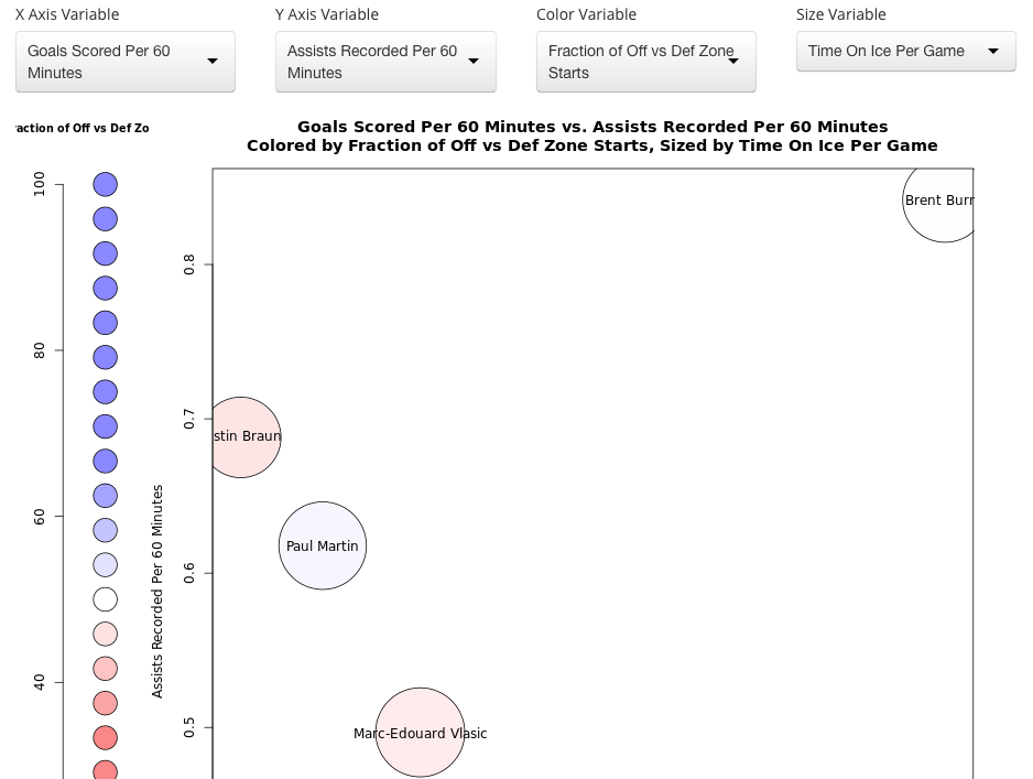
Graph Three: Goals and Assists
How to read the graph
This graph is fairly simple as it plots goals per 60 (x-axis) and assists per 60 (y-axis). These are just how many goals and assists a player would score for every sixty minutes of ice time they get. Offensively gifted players will appear on the top-right.
The dot size and color measurements still remain the same.
Graph Conclusion
These results are quite different from the previous ones. Vlasic, who has topped every comparison so far, now finds himself in the lower-left region. This category instead belongs to the wookie, Brent Burns. Though he did spend time as a forward a few years ago, he has been an offensive machine on the blue line and continues to produce at an excellent rate.
Vlasic, Braun and Martin are on the left half of the graph, indicating that they earn many more assists than goals.
One thing that is similar to the other graphs: Dillon is still the bottom man. In fact, he didn’t even fit on the graph screenshot because his position was too low. The former Dallas Star was projected to be a quality top-four skater, but he has failed to show competence in any major section of this analysis.
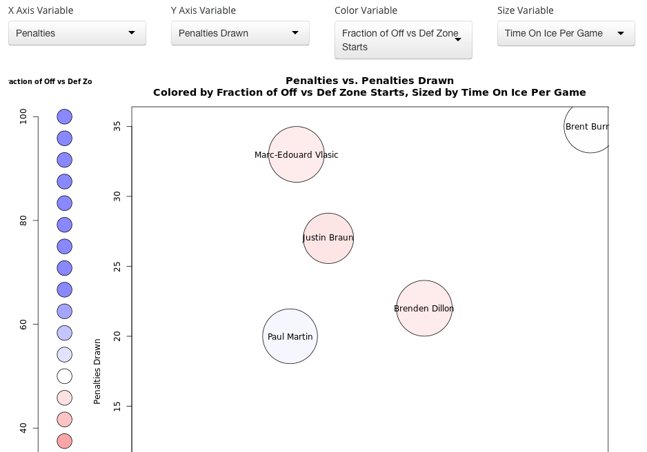
Graph Four: Penalty Assessment
How to Read the Graph
For our fourth graph, we will look at penalty numbers. More specifically, we will look at the difference between penalties taken (x-axis) and penalties drawn (y-axis). Contrary to other graphs, players want to be on the top-left of the diagram, as this shows a low amount of penalties committed with a high amount of penalties forced on opponents.
Zone starts and time on ice are still shown as dot color and dot size.
Graph Conclusion
Vlasic returns to the top-spot in this situation since he draws the most penalties without taking many himself. His incredible possession skills and tendency to help create chances in the offensive zone are probably huge contributors to this trait.
For once, Dillon kind of fits in with the rest of the group. He may still be one of the worst guys in the set, but it’s by a much smaller margin.
Burns has the ability to force opponents into taking penalties, but he also takes many of his own. Unfortunately, the two numbers aren’t close to one another, meaning his penalty differential is in the negatives. If he can clean up his play in the defensive zone, then he could be one of the best in the category.
Graph Five: Body Punishment
How to Read the Graph
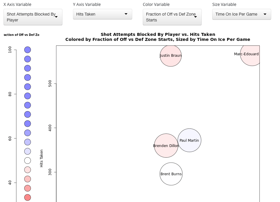
The final graph of the article focuses on sacrificing the body. Here we can see the amount of hits a player has taken and cross-reference it with the number of shots they have blocked. A player who suffers from more physical punishment will be located on the top-right of the graph.
No surprise: dot size and color still mean the same exact thing.
Graph Conclusion
San Jose’s top defensive pair of Vlasic and Braun take the most abuse by a mile. The two of them have absorbed more hits than any other defenseman on the roster while also blocking a high number of shots. This shows how committed they are to shutting down the best the league has to offer. The only thing that worries me is how much more they can take during their career, as they are both still under 30-years old and have a long path left in the NHL.
Everyone else is floating around the middle of the diagram, blocking a fair amount of shots and taking their share of hits. They are doing their job, but are not suffering as much as the two men the Sharks rely on the most.
Overall Conclusion
To be concise, Vlasic is easily Team Teal’s best defenseman while Dillon is hands-down their weakest. The other three can all swap positions depending on the situation.
San Jose has an incredible defensive group this season that can generate scoring chances, put up points and draw penalties. If the bottom pair records even mediocre possession and goals-for numbers, then the Sharks have a chance to make it far this year. That’s how strong the top-four is.
If you have any questions about the data that was used or the conclusions that were drawn, ask me in the comments or on Twitter.