The Arizona Coyotes, at the time long overdue for a uniform change, rolled out their current uniforms in time for the 2015-16 National Hockey League season. However, the new rendition leaves much to be desired.
An Unbalanced Mess
At first glance, the addition of black seems to be a welcome one, given the relative blandness of the previous edition (I’ll get to that one later).
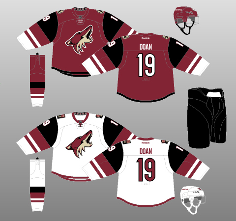
The black certainly livens up the jersey, but still doesn’t solve the fundamental problem that has plagued the ‘Yotes’ duds since 2007: a lack of tail striping. Many teams went along with this unfortunate trait of the Reebok Edge uniform system, before realising it looked silly – even practice-y – to not have anything at the bottom of the jersey. The Toronto Maple Leafs and the St. Louis Blues are examples of teams that, dissatisfied with the redesign, reverted – smartly – back to a jersey with tail striping. Arizona would do well to follow suit.
On a different note, the modifications made to the sleeves creates a new problem: There are now three colours on the sleeve, which, in the current arrangement, looks overly busy when compared to the single colour of the jersey body. In addition, the stripes on the sleeves are not only all different colours, but differently sized as well, with no discernible symmetry (compare these sleeve stripes with the slim-thick-slim pattern of their previous jersey). All this busyness combines to make the Coyote’s latest effort unbalanced and disorienting. Though Pippi Longstocking might approve, the human eye does not.

As for the rest of the kit, the black pants actually look rather nice when contrasted with the white or brick red of the jersey body. However, the socks carry over the unfortunate condition of the jersey sleeves; just far too much going on.
Though confusing to look at, perhaps even more importantly, it still manages, somehow, to be as uninspiring as the old model. What if all the stripes were wiggly lines? What if the players wore the jerseys inside out? What if they set them on fire before taking the ice? They would still look unpleasant, but at least it wouldn’t be boring.
Bad Genes
The current iteration of the Coyotes jersey manages to be both frustrating and uninspiring at the same time. If you’re wondering why you’re not surprised by that, this is swiftly becoming a theme with the Coyotes. Check out their last couple efforts, starting with those introduced for 2003-04.
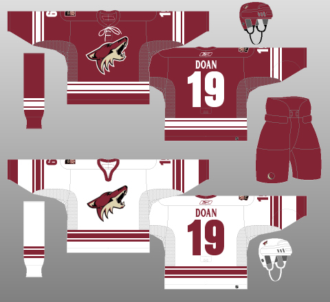
At first glance, these kits are not half-bad. The slim-thick-slim pattern on the sleeve and tail striping is as traditional as hockey jerseys can get, and the brick red and white contrast nicely with each other. Curiously, the shoulder patch only appears on one shoulder. Lace-up collars are always appreciated, though I would have liked to see them on the away jersey as well as the home. The home jersey could also have used the contrasting collar present on the away version, but now I’m just being nitpicky.
Where this uniform really falls down is that…well, again, it’s boring. Be honest: you probably remember them best on goaltender Brian Boucher, flailing about on the ice while Alex Ovechkin scored his ridiculous behind-the-back goal.
Two-tone colour schemes generally work when the secondary colour is plentiful enough to provide a visually satisfying counter to the primary. Take the Toronto Maple Leafs, for example. On the home jerseys, there is enough white to ensure that blue does not wash out the visual, and vice versa for their road kits.
This Coyotes entry placed too much emphasis on the primary colour; the stripes were simply not thick enough to counteract the background colour, and contrasting shoulder yokes were not included. As a result, the team looked like an amorphous blob of rust puttering about on the ice. A more perfect representation of the Coyotes franchise I cannot find.
More of the Same
Amazingly, the Coyotes’ design choices proceeded to get even worse, circa 2007-08 and the Reebok Edge redesign.
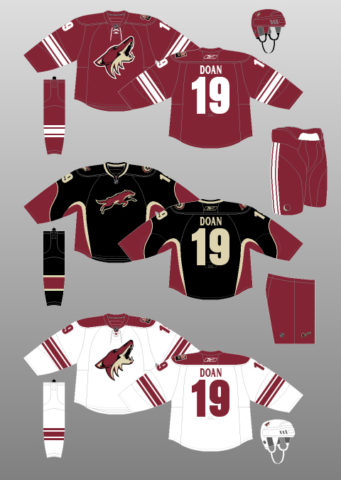
A contrasting shoulder yoke was added to the away kit, definitely a good decision. As was the addition of contrasting striping to the previously solid-brick red pants. However, the ‘Yotes chose, like so many other NHL teams, to do away with the tail striping at the bottom of the jersey. So, though the uniforms were still boring and washed-out, the redesign turned them into glorified practice jerseys. Ugh.
Their black third jersey, though definitely different, was not much better. The re-introduction of sand to the Coyotes colour scheme was a welcome addition, though the curly vertical striping was just downright weird. Even the logo looks as though it’s trying to run away.
Kachina Ka-Ching
So where do the Coyotes go from here? If anything, why not bring back the “Kachina” kit introduced in their inaugural season? After all, they’ve done so before, to great applause.
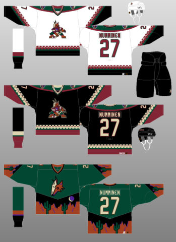
Yes, the logo is a tad unsettling and yes, that textured striping is a bit unusual. But hey, it’s not overtly offensive and certainly stands out in comparison to the current uniform, which is a symphony of bland.
Take the current logo – the howling coyote. Decent enough, yes. But the San Jose Sharks crest is an angry shark chomping down on a hockey stick. The old Florida Panthers emblem depicted a panther pouncing on an opponent. In contrast, Arizona’s coyote just seems to be howling aimlessly off into the distance (maybe trying to sell tickets?).

More aggressiveness is warranted. Or, in the case of the original, more creepiness. Disturbing logo aside, it is symmetrical and balanced, and everything about it screams “American Southwest”. And how about that eerie-looking green third jersey, introduced for 1998-99? Psychedelic, man. For a team seeking to establish nostalgia and tradition, why not? I’d buy one, and I don’t think I’m alone.
Make It Yours
To put it bluntly, the Arizona Coyotes have had problems selling the game in their market. Yes, they’ve got a young, up-and-coming team that should make some significant strides next season; winning will definitely help with marketing. But another huge part of branding is making your fans proud to wear your colours. Straight up, the Coyotes cannot afford to be boring. It’s time to think outside the (brick red) box.
(All illustrations by Andrew M. Greenstein, The unofficial NHL Uniform Database.)
Originally published in April 2017