Over the last two decades, third alternate jerseys have been a staple for most NHL teams. From the dazzling, to the unappealing, and to those gone too soon – alternate sweaters have ingrained themselves fairly well into hockey culture since the 1990s.
While some teams rarely, or never, incorporate an alternate jersey, there are a number of teams that have done so at a very successful level. Despite the fact that some alternate jerseys have brought shame to some NHL franchises, there are certainly more than enough instances where teams have blended the right colors and design schemes to make their respective fan base proud.
Calgary Flames (1998-2000)
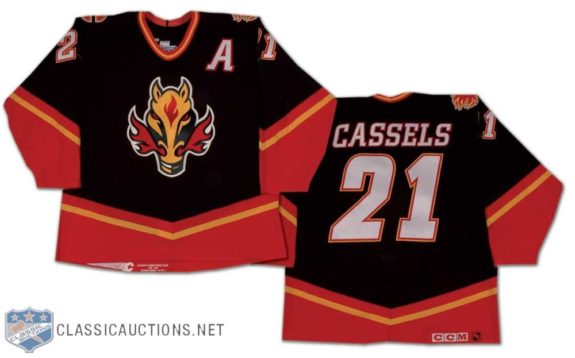
The Calgary Flames’ first alternate jersey was introduced in 1998 and was used by the team until 2006 – something that indicates that this jersey was met with quite a positive reaction. Not only does the use of black, red, and yellow colors and striping make the Flames’ jersey stand out, the flaming-nostril horse’s head also draws attention to this well-crafted sweater. While this jersey served as the Flames’ alternate jersey from 1998-2000, the jersey was obviously received well enough to become the team’s home uniform from 2000-2003 seasons and even served as the team’s road jersey from 2003-2006.
Dallas Stars (1997-1999)
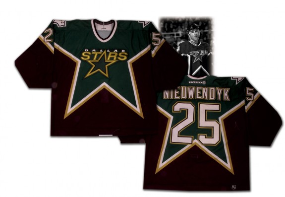
Much like the Flames’ horse-head jersey, the Dallas Stars’ third jersey (introduced in 1997) enjoyed a great amount of success and longevity from the late 90s to early 2000s. Primarily employing the use of green and black colors along with white and gold outlines/striping, the Stars modeled their first alternate jersey after, well, a star. The design is simple, but manages to catch one’s attention due to the interplay of black and green colors. Seeing as how this alternate jersey managed to make its rounds as the Stars’ road jersey during the early 2000s, it’s safe to say that the design was a popular staple amongst fans for almost a decade.
Florida Panthers (1998-2003)
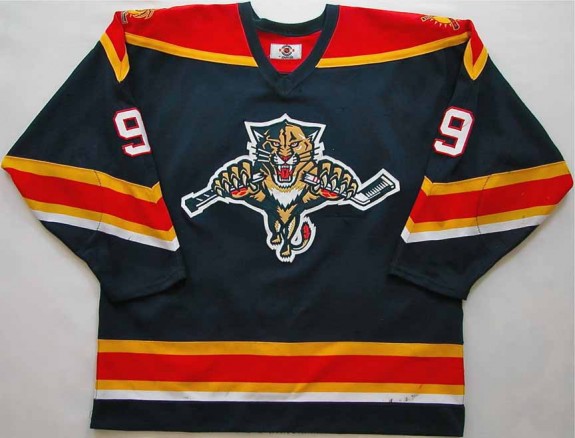
Navy blue and red, yellow, and white striping patterns along with a panther breaking apart a hockey stick. It might be pretty hard to miss this jersey in a crowd. Sure, the Panthers did not deviate from their original jersey design with their first alternate jersey, but the navy blue coloring and the multi-colored stripes definitely made this a jersey to remember. While the broken hockey stick in the panther’s paws is somewhat reminiscent of the San Jose Sharks’ logo design, the jersey worked very well for the franchise as it was in use until the end of the 2007 season – at which point the shoulder and striping patterns of the jersey were altered but the navy blue color retained.
Los Angeles Kings (1999-2002)
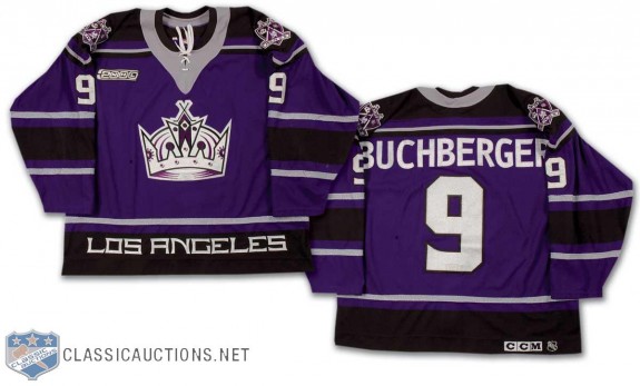
The Los Angeles Kings’ first attempt at a third jersey results in the widely criticized “Burger King” sweater which did not last very long in the NHL. However, the Kings’ second attempt went back to the team’s roots to some extent as Los Angeles rolled out a familiar, yet darker, shade of purple with their 1999 alternate jersey. Going back to purple certainly worked in this instance as the Kings’ purple jersey was used by Los Angeles until the 2007 NHL season, albeit with some alterations to the sweater’s crest.
New York Rangers (1996-1998)
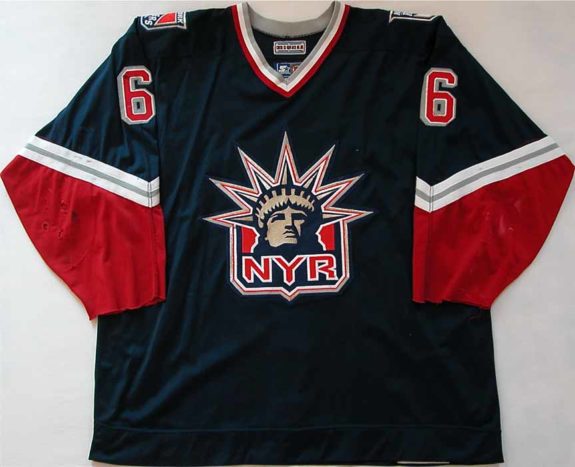
For a team that stuck to a certain type of design for most of its existence in the NHL, the Rangers definitely had a hit with their first alternate jersey in 1996. The use of colors such as navy blue and red, as well as white and gray striping patterns make this sweater an easy target for the eye, and one can’t help but to be drawn toward Lady Liberty after their eyes process all of the primary colors in play. Despite using a darker shade of blue than that which New York Rangers fans were used to seeing, the Statue of Liberty crest undoubtedly appealed to the Rangers’ fan-base during the late 90s – so much so that the jersey (and the Statue of Liberty crest) lasted until the 2007 season, with the exception of the 1998-1999 NHL season.
Pittsburgh Penguins (1995-1997)
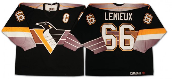
Who doesn’t remember Mario Lemieux or Jaromir Jagr in a photo with one of these jerseys on? Even though the logo in the center of the Penguins’ jersey wasn’t changed that much, the gray (left side) and yellow (right side) stripe(s) added a very appealing aspect to this sweater. The gray, white, and yellow stripes on the sleeves were also a nice touch on these jerseys, and it’s easy to see why these jerseys enjoyed a fair amount of success until their use was discontinued after the 2001-2002 NHL season. While the Penguins were one of the first teams to experiment with alternate jerseys, their initial venture into such an endeavor was definitely a good one.
San Jose Sharks (1997-1998)
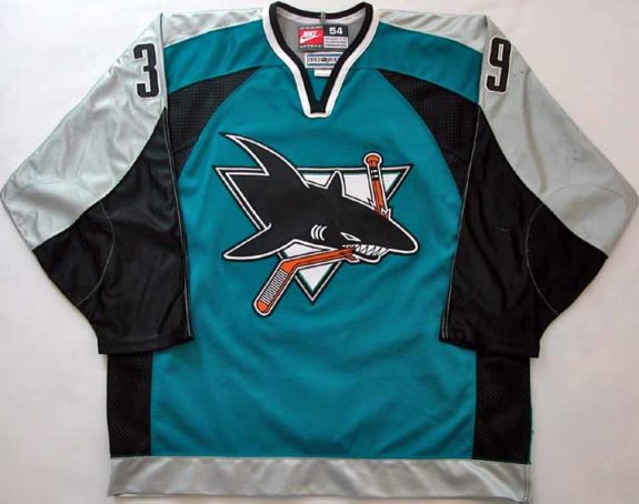
The San Jose Sharks have always had a winning design for their jerseys, and their first alternate jersey was certainly up to par. While the logo in the center did not change at all, the “wavier” patterns on the jersey definitely made it stand out more – especially since gray and black colors were used way more prominently in this design. The Sharks also used these jerseys up until the 2007-2008 NHL season and even incorporated the curved design patterns on their other jerseys from 1998-2007. Despite the fact that the Sharks didn’t re-invent their alternate jerseys a la the Los Angeles Kings or New York Rangers, their sweaters illustrated how simple design changes could go a long way in continuing a solid and highly marketable product.
A Special Thank You To:
- NHLUniforms.com for their unofficial database and collection of jersey graphics and designs.
- Classic Auctions and Game Worn Auctions for jersey photos – good sites for all of your jersey wants/needs.