When the New York Islanders unveiled a black, Brooklyn-themed jersey prior to the start of the 2015-16 season, immediate reaction was mostly negative. Fans complained that the new look broke too sharply from the team’s classic color scheme, that it did little to recognize the team’s history in Nassau County, and, perhaps worst of all, that it severed ties with the team’s original fanbase.
Some of the criticism was justified. Most of it wasn’t.
Those that condemned the jersey from a sartorial perspective had every right to do so. Style is wholly a matter of opinion, and fans who felt the black-and-white design was off-putting or over the top or just flat-out ugly weren’t inherently wrong or right. But they were absolutely entitled to hate it – or love it – based on how it looked.
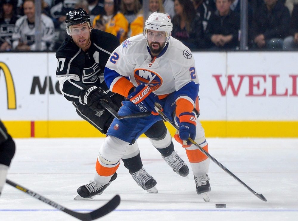
(Anthony Gruppuso-USA TODAY Sports)
Everyone else who took umbrage with the uniform because it ignored the Islanders’ history or snubbed the original fans or pandered to Barclays Center or so obviously chose Brooklyn over Nassau County (and, see, this is just the first step in moving past the true fanbase forever…) was simply out of line.
Oh, and to the fans that rejected the jersey on the grounds that the Islanders have never worn black before: remember this? Sure, it wasn’t the most popular sweater in the team’s history, but this whole black getup thing isn’t unprecedented.
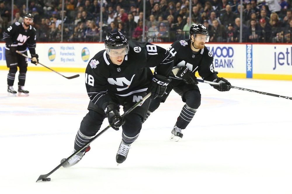
Honoring History
From a design standpoint, the new uniform does a great job of recognizing the team’s past. The four white stripes on the sleeves of the jersey and the socks pay homage to the team’s four Stanley Cups. The “AL” patch on the left shoulder honors the late Al Arbour, the winningest coach in franchise history and commander of the Isles’ 1980’s dynasty. And the “NY” insignia stitched across the chest is taken directly from the team’s original logo.
(Jayne Kamin-Oncea-USA TODAY Sports)
It’s important to note that this new look isn’t replacing the old one. In fact, the Islanders are wearing their black alternates in just 12 home games this season, meaning that, yes, in those 70 other games, the Isles will look as they’ve always looked. And it’s further important still to clarify that the Islanders have no intention – ever – of ditching their trademark style.
Asked if the Islanders would ever adopt black and white as their full-time colors, Barclays Center COO Fred Mangione said, “No. That was never even talked about nor would we ever do that. We’re not changing the blue and orange and the tradition and especially that logo that means so much to the fan base. That will not happen.”
Bonding with Brooklyn
Ultimately, the introduction of a new jersey is part of a marketing mission – and the Isles are in the midst of a critically important one right now. This black-and-white look is a nod to the Islanders’ new home and an attempt to connect with the people who live there. As that connection deepens, so too will the team’s fanbase.
The Isles’ original fans should embrace the fact that their ranks are growing, even if it means they have to watch their team wear these modern-looking sweaters every now and then. For a fanbase that has often struggled to expand its domain, that seems like a pretty small price to pay for a hefty chunk of new territory.
In terms of the Isles’ long-term viability as a New York team, their move to Brooklyn can either be crippling or catalyzing depending on the flexibility of their brand. If they can a) maintain ties with their original fans in Nassau County and b) attract new fans in Brooklyn, they stand to develop a following of such diversity and passion the franchise has never before seen. But if they neglect, wittingly or not, one group in favor of the other, the franchise’s first real opportunity for extensive regional appeal will go squandered.
And what a shame that would be.
Look – is this bold, black jersey a departure from tradition for the Isles? Sure it is. But this team underwent a pretty serious departure – you know, the literal kind – before this season began. And they no longer belong exclusively to Nassau County.
This is Brooklyn’s team now, too; that’s the hope at least. To foster a sense of camaraderie between the city and its new hockey team, the Islanders have introduced a uniform that they feel reflects Brooklyn’s spirit. And to heighten the courtship, they even included “BKLYN” on the team’s black helmets.
Good for them.
Because there is a new generation of hockey fans in the making, and the kids from Brooklyn have another team to choose now. In years past, they would have worn a jersey with the name Gilbert or Leetch or Lundqvist on the back and imagined themselves playing for the Rangers in Madison Square Garden. Now, they just may pick the one that says Tavares, the black one that stands for Brooklyn, and imagine themselves playing for the Islanders in Barclays Center.