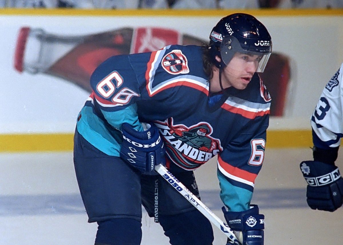
It’s no secret that many New York Islanders fans, and hockey lovers around the world, find it easy to poke fun at the team’s foibles during the mid-1990s. Chief among those peculiar choices was the decision to change their jersey heading into the 1995-96 season.
Whether you call it the fish sticks jersey, the Gorton fisherman, or captain high liner, the design was a major departure from the classic Islander jerseys that saw little to no change in their 25-year history to that point. And while aesthetically speaking, it is — to put it lightly — not great, some fans who grew up in that era have a strong affinity for it despite the team not performing well during that time.
Fisherman Dread
It’s understandable for fans to want to see the fisherman set to sea in a Viking funeral never to be seen again. The team was absolutely terrible in the mid-’90s thanks to an awful general manager in Mike Milbury, ownership issues featuring Jon Spano, and a leaky Nassau Coliseum roof. The connection between the team and the uniforms they wore makes a lot of sense.
Nick Hirshorn, author of the book We Want Fish Sticks: The Bizarre and Infamous Rebranding of the New York Islanders made an interesting point in an interview with the New York Post in 2018. “You really want to rebrand when you have a winning team,” Hirshon said. “It’s not a Band-Aid to cover up when you’re losing. Fans will see right through that.” And see through it they did. (from ‘Billy Joel, mascot threats: Inside Islanders’ disastrous fisherman logo,’ New York Post, 12/06/2018)
It’s clear that the vile contempt for the fisherman remains in full effect from who saw this as a disgrace to a team that capped off 19 straight playoff series wins, five straight Stanley Cup Final appearances, and four straight Stanley Cups a little more than a decade before its release. But there are two sides to every story.
Nostalgia Remains
Though Hirshorn’s analysis holds a lot of truth, especially for die-hard fans from the dynasty era, that isn’t the only side to the story. For many fans, including myself who were born in the late 1980s and early ’90s, their earliest memories of the Islanders were of the team in these uniforms. Regardless of how terrible the team was, the awful trades, or even the empty arena, the sense of nostalgia for these jerseys remains strong to this day.

As previously mentioned, few would argue this jersey set up objectively looks good. The fisherman is ridiculous, the color scheme screams the mid-’90s and the wave on the bottom and curved name-plates and numbers would make even the most seasoned sailor seasick.
But it’s not the artistic beauty, or lack thereof, that attracts fans. It’s a time and place; memories of pure enjoyment before we slowly shifted from fans to fanatical. Personally, all of my original Islander paraphernalia that’s survived my childhood is fisherman related. If I see the colors, the wave, or even the lighthouse shoulder patch, I smile. So, excuse us Islander fans who wouldn’t mind seeing it come back in all of its disgusting glory, even if it’s just a small piece or even just for warmups.
Fortunately — or unfortunately, depending on which part of this article you connect with — the Islanders’ reverse retro is expected to be more subdued compared to other teams around the NHL. With general manager Lou Lamoriello at the helm, it was hard to think he would bring back these jerseys. Additionally, as owners Jon Ledecky and Scott Malkin pour millions of dollars into the Islanders’ future, the thought of focusing on an era of the team’s history that brings up, at best, mixed feelings probably isn’t in the strategy. They’ve capitalized on the logo for merchandise, but it’s safe to say the fisherman is most likely permanently docked.