The NHL announced another installment of the Reverse Retro jerseys that debuted during the 2020-21 season. Some jerseys were wildly popular (Colorado, Carolina, Minnesota, *chefs kiss*), while others received significantly less excitement (Dallas and Detroit, yikes). According to Icethetics, this new take on the old is expected to be ready in time for the 2022-23 season.
So, as a jersey nerd, I felt it was my duty to toss my creative cap into the mix for the Boston Bruins‘ new version.
Step One: Check the Bruins’ Vault
As with any task, our first step is figuring out what design should inspire the jersey. The Bruins are a double-edged sword in this regard. As an Original Six franchise, there are so many different options to pull from and so much history to work with. In that same vein, the Spoked B is a classic look that has remained roughly consistent for most of the club’s existence. Where some see a challenge, I see opportunity.
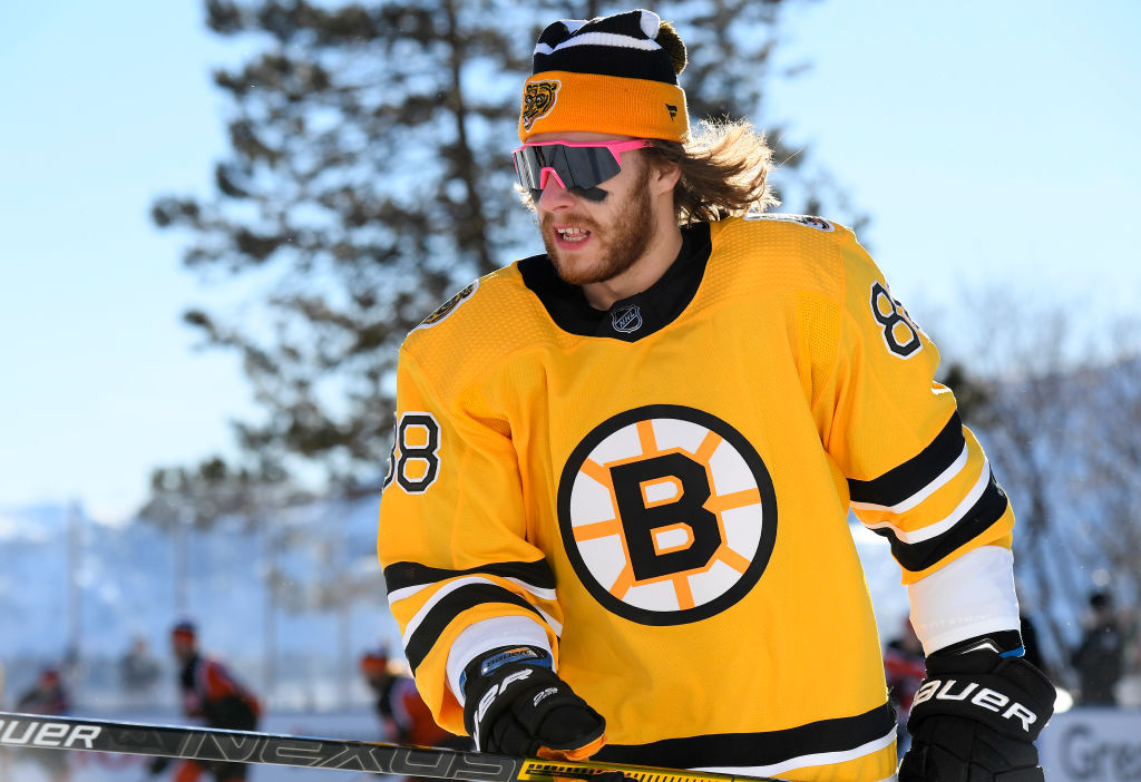
To start with, here’s a look at the first Reverse Retro the Bruins unveiled. As fans will remember, the team wore these beauties during their outdoor game at Lake Tahoe last season, highlighted by David Pastrnak’s Macho Man Randy Savage sunglasses, Jaroslav Halak’s mullet under his helmet, and Pastrnak’s soundbite of the year, decrying the national broadcast for pulling him away from Barbie Girl in the locker room. These were amazing jerseys, and some teams wish they had the luxury of hitting a home run on the first pass as the Bruins did. But we’re not here to read an article that says ‘play the hits.’ We won’t take the cop-out of saying do this jersey again. That doesn’t mean we can’t take pieces of this idea and implement them into our new jersey.
There are two philosophies to pick between as we design our jersey: Harken back to a championship team and add a modern interpretation on a classic jersey Or (yes, that’s a Bobby Orr pun) pick a jersey that was universally hated when they first debuted but has grown a cult following in the years since their retirement.
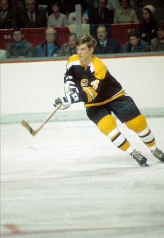
Nostalgia sells, and there is a warm and fuzzy feeling that comes with bringing back a jersey that generations of old saw their favorite players wear and are now being worn by this generation’s favorite players. This approach would likely involve picking a jersey from the 1939 era to capture both Cups from 1939 and 1941 or modifying a jersey from the 1970 and 1972 teams. In a quick search, 1970 and 1972 would be the likely winner because our reference from four lines ago was on the team.
Bobby Orr is still one of the most recognizable hockey faces in Boston. Take one lap around TD Garden, and you are guaranteed to see at least a few “Orr 4” jerseys.
The thought of turning to a quirky jersey that was hated in its time but is experiencing a renaissance seems odd but has past examples to reference. Arizona unveiled their desert-themed, coyote head purple jersey with the desert landscape based on the third jersey from 1999. The Calgary Flames broke out their “Blasty” jersey, featuring a horse head breathing fire instead of their typical C crest.
The Vancouver Canucks broke out their gradient jersey from 2001, updating the original red and blue to their current colorway of green and blue. Two-thirds of this group was a clear success. Sorry Canucks, this isn’t the only thing you guys had working against you last season.
Step Two: Which Bruins Logo?
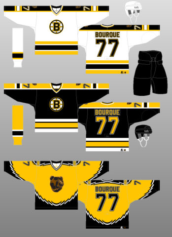
For a Bruins spin, there are two variations of a realistic Bruin that can be debated. First, the affectionately labeled Pooh Bear jersey the team sported from 1996 until 2006. The Bruin head on the center of this gold jersey has a realistic touch to it, with maybe a slight smile peeking through? Either way, the shoulders are adorned with a size 72, all caps “BRUINS” wordmark, making sure every fan knew which team was on the ice. The black and white design around the base of the sleeves and bottom of the jersey added an extra flash of gaudiness to this jersey that seems to encompass the late 90s and early 2000s as well as anything ever might.
Related: Top 5 Boston Bruins Uniforms of All Time
Option number two is the less affectionately nicknamed “Crack Bear” that was a shoulder logo for the 1980s Bruins. As the name implies, this Bruin head is painted black and gold with very, very wide-open eyes. The teeth are bared, and it looks very fierce with a side of out-of-control sprinkled in for good measure. This logo has not made an appearance on the center crest, but it did grace both shoulders of Bruins players at home and on the road during the 80s.
So which logo wins out? After going the nostalgia route last round, we take the bold step of picking one of the variations of logos that did not get their proper due. The nostalgia of an Orr-era jersey is there, but the franchise icons of Cam Neely and Ray Bourque were represented in the first Reverse Retro. Now it is time to be bold.
The question now is which bear takes center stage? The trusted news source, Twitter, is split on the matter. “Crack Bear” made an appearance as a shoulder patch on the last Reverse Retro jersey. For that reason, Pooh Bear is making a return. The bright gold looked fantastic last year. That is an option to replace the mustard yellow of the original Pooh Bear jersey.
What I would do is flip the jersey. Keep the Pooh Bear logo but put it on a white jersey base. Instead of the massive wordmark, we would tone it down with the modern Spoked B logo, tying together the old with the new. Take the gold colorway from the first jersey and run that across the shoulder pad area. Pair that with the same yellow color for the bottom third of the sleeve and capped with a black bar separating the yellow from the white part of the jersey.
As fun as it would be to go full chaos, we cannot in good conscience suggest pairing this jersey with gold pants or equipment. I would, however, add yellow socks with the typical two stripe Bruins look, one black, one white.
Step Three: Submit to Adidas
The Bruins’ storied history is a blessing and a curse. The team has decades of jerseys to pick from for their next Reverse Retro setup, but most of the jerseys of old are nearly identical to the others. In the Pooh Bear, the Bruins have an interesting wrinkle they can bring back in a limited capacity, appeasing a younger crowd in search of something different than the Spoked B without getting too wacky and instituting a full break from the past consistently.
I’ll be checking my mailbox regularly for a jersey. Thanks, Adidas!