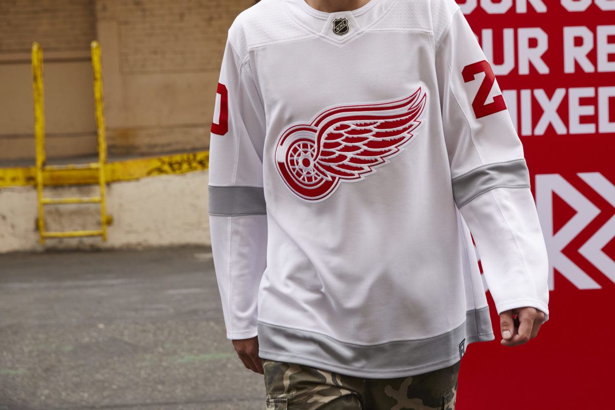
There has been plenty of buzz about the release of Adidas’ NHL Reverse Retro hockey jerseys yesterday. A quick look highlights flashy colors, alternate logos, and nods to the ghosts of teams past. The Detroit Red Wings, though, presented designers with a complex challenge: How do you take an Original Six franchise, with an already-classic sweater design, and improve on it?
Simple. You don’t mess with it at all.
When the NHL announced the concept, some expressed concern about altering a classic look. After releasing the design, it’s clear Detroit’s Reverse Retro jersey doesn’t reinvent the winged wheel but instead honors the past while acknowledging the team’s future.
Reverse Retro Red Wings Jersey Keeps it Clean and Simple
The effort is clear – if it isn’t broke, don’t fix it. The basic white sweater bears the classic Red Wings logo, like the ones that graced the chest of captain-turned-GM Steve Yzerman in the late 1990s. Per a joint press release from the NHL and Adidas, the jersey is inspired by the one worn in 1998, and the splash of gray incorporates the 2017 Centennial Classic kits. Each one will be worn multiple times throughout the 2020-21 season, in designated rivalry games, and will be available for purchase on Dec. 1 at both adidias.com and nhlshop.com.

It’s easy to get emotional conjuring up memories of the 1997-98 NHL season, one of the most memorable in Red Wings history. One season earlier, after Detroit claimed its first Stanley Cup in 42 years, there was hardly any time to relish the victory before Vladimir Konstantinov, Slava Fetisov, and team masseur Sergei Mnatsakanov were involved in a devastating car accident. The tragedy ended Konstantinov’s career, and while he and Mnatsakanov fought for their lives at Beaumont Hospital, teammates and fans held near-nightly vigils in hopes of recovery.
The following season, wearing “believe” patches on their jerseys, the Red Wings became the first team to repeat as champions since the Pittsburgh Penguins did it in 1991 and 1992. No one will ever forget the celebration on the ice in Washington D.C. when Yzerman handed Konstantinov, who was confined to a wheelchair, the Stanley Cup.
The other cited source of inspiration for the jerseys, the NHL Centennial Classic, was an outdoor game in Toronto between the Red Wings and Toronto Maple Leafs on Jan 1, 2017. The game was not only used to highlight Toronto’s centennial season, but also kicked off a year-long celebration of the NHL’s centennial.
Though the Maple Leafs won the game 4-3 in overtime, it offered fans a glimpse of Detroit’s future. Anthony Mantha and Dylan Larkin helped the Red Wings rally from a 4-1 third-period deficit to force overtime, highlighted by Mantha’s second goal scored with just two seconds left in the third period.
The Hockey World Reacts
Though the simplicity of the jersey is a nod to Red Wings past, reactions to the sweater on social media have been mixed, at best. Pundits who were underwhelmed by the design have likened it to a practice jersey.
A few local Detroit publications also lamented the jersey’s design, though a popular Red Wings blog opened up a “safe space” for fans to acknowledge that they do, indeed, approve of the concept. So far, though, comments of heaping praise remain few and far between.
Regardless of the end result, the marketing concept was clear, given that the ongoing pandemic has affected attendance and league revenue. Whether you love or hate the design, the classic look of the winged wheel against a white sweater will always conjure up memories of the past, providing a taste of nostalgia during what has felt like a long Red Wings rebuild.
More from The Grind Line
Want more Red Wings content? Tune into The Hockey Writers’ Grind Line – a new weekly live show on YouTube and Facebook. We stream Friday nights starting at 8:00pm ET on The Hockey Writers YouTube channel. Check out last week’s show below: