Originally published in Sep. 2020
The Buffalo Sabres unveiled their new uniforms for the 2020-21 NHL season last month. Now it’s time to look back at past uniforms, and why not make it interesting? Let’s rank them.
Related: Dale Hawerchuk Trade Revisited
The uniforms are divided into two categories: home/away and third/special editions. This way, there’s more room to focus on certain elements rather than lumping everything into one big list. Let’s get started, shall we?
Home/Away Uniforms
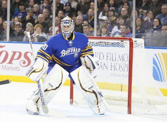
5. Navy Nonsense (2010-20)
These uniforms aren’t terrible, but they’re not good either. They’re frustrating in their design and how the team performed wearing them. We wanted to see a return to royal. Instead, we got the template of the originals with a modernized navy/gold color scheme. To make matters worse, these had silver trim and piping.
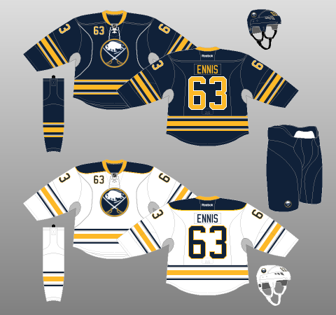
The only redeeming qualities of these jerseys were that they were worn during the Sabres’ last playoff appearance in 2011, before their current nine-season drought, and Jack Eichel and Rasmus Dahlin made their NHL debuts in them.
Later modifications of these jerseys included removing the silver side piping and armpit stains. It made them easier on the eyes, but that was about it.
4. The Buffaslug Era (2006-10)
These aren’t the most celebrated uniforms in franchise history, and the logo is certainly the worst, but these uniforms used some interesting striping patterns that you rarely see.
Combine the unique look with two first-place division finishes, two playoff appearances and a Presidents’ Trophy, and these jerseys are sure to have a nostalgic revival down the road.
3. Return to Royal (2020-??)
Finally, fans got what they wanted: a return to royal blue. To be on the safe side, the organization decided to take the original set and give it a modern twist. Drawing on elements from the 50th-anniversary jersey, the main crest has textured detail in the buffalo. Another cool feature is the design on the inside collar, a nod to the City of Buffalo seal.
The problem for some may be the white trim on the sleeves and bottom stripes of the home jerseys, which looks a bit too busy.
2. The Goat Head Era (1996-06)
A new arena to call home in 1996 meant brand new uniforms. The Sabres went in a totally different direction, ditching the blue and gold in favor of a bold new look.
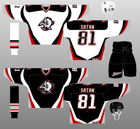
These jerseys are the product of their time. However, they received generally positive reactions at first. Despite some backlash, the Sabres had success donning these, including a Stanley Cup run in 1999. It’s even believed there is a hidden buffalo head within the jersey template. (from ‘Who knew? Sabres’ ‘goat head’ jersey had hidden buffalo head,’ Buffalo News, 04/12/2018) Plenty of fans have voiced their wish for these to make a comeback.
1. The Originals (1970-96)
You can’t beat the classics. The home and away jerseys that spanned over two decades are incredible. They are clean, timeless, and have that beautiful royal blue fans adore.
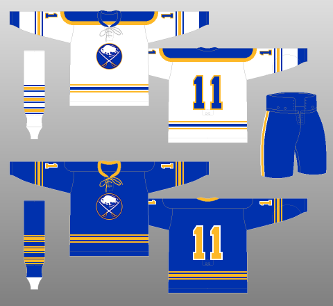
They remained relatively unchanged over the years, barring some modifications. These uniforms are what many older fans associate with their best Sabres memories. The whites have a blue shoulder yoke with a gold trim around it that sort of resembles an old French officer’s epaulette. And what did some soldiers wield? Sabres.
Third/Special Edition Uniforms
*Doesn’t include the 2006-07 third jersey (essentially an updated version of the original blue jersey), the 2008 Winter Classic jersey (updated version of the original white), or the 2008-10 third (which became the 2010-12 home).
5. The Turd Burger (2013-15)
Good grief. Is there anything good to say about these? These are arguably the worst jerseys in history. It’s borderline torture to mention them. The crest barely has an outline in these half-gold, half-navy, also-random-silver-all-over jerseys.
Perhaps the only redeeming quality is that they had cool captain patches – but wait, they were on the shoulders. Why?
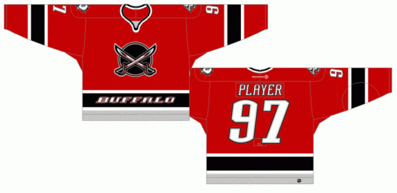
4. Butter Knives (2000-06)
Although many may disagree, these are the best third jerseys the Sabres have ever had. Dubbed the “Butterknife jersey,” this one got its nickname from the enlarged sabres crossing the chest. The bottom “Buffalo” nameplate doesn’t help its appeal, but if the Sabres were looking for something unique, they definitely got it here.
The stylized collar was a nice touch, and all things considered, this is the only sweater that has the name of the franchise displayed boldly on the front.
3. 40th Anniversary (2010-12)
With four stripes on each sleeve and the bottom of the jersey to symbolize four decades of Sabres hockey, this one was a success.
The old school script on the chest was generally a hit, and the only real complaints were about the gold nameplate and perforated stitching on the numbers. In their defense, these features were meant to create a “fauxback” look.
2. Winter Classic (2018)
With some blue stripes bordering the gold stripes, this made the Sabres’ most recent Winter Classic outing a striking one.
A new shoulder logo made its first appearance, but one bad thing about this is the unfortunate addition of “NY” at the very bottom of the primary crest, between the two hilts of the sabres. It makes the circle logo look busier than needed.
1. 50th Anniversary (2019-??)
This one should come as no surprise. A beautiful uniform that combines old and new. The five stripes on the sleeves, bottom trim and socks honor each decade of Sabres hockey. This jersey also introduced the textured bison feature on the chest logo, and the inside collar has logos through Sabres history etched into it.

It’s hard to debate that this is the best in its category when a March 1 Buffalo News article reported each shipment of the jerseys had been sold out to that date:
Kevyn Adams, the Sabres’ senior vice president of business administration, told The News in a recent interview that the team underestimated customer demand, as each shipment has sold out since the jersey was made available for purchase Sept. 17. Approximately 7,000 jerseys have been sold.
Lance Lysowski, The Buffalo News
After COVID-19 abruptly halted the Sabres’ 2019-20 season, these may return in the near future.
Honorable Mention: The 9/11 Tribute (2001)
This one doesn’t really need to be compared to the others. In a show of solidarity after the tragic events of 9/11, the Sabres wore these uniforms that were similar to their opponents, the New York Rangers. This was the first game back at Madison Square Garden after 9/11. Ignoring any type of ranking, these hold a special place in Sabres history.
Related: The French Connection
Of course, not everybody has the same opinion, but based on some documented public reception of the listed uniforms, perhaps this is a slightly accurate indication of where the Sabres’ jerseys rank.
Do you agree? Disagree? Let us know in the comments!
