(Warning: there is not a single “flying high” or “flying low” pun in this article. If you’re looking for that kind of thing, move along. There’s nothing to see here.)
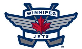
On July 22, the Winnipeg Jets unveiled the logos that will adorn their uniforms for the 2011-12 season. Reaction across the interweb has been mixed. Some have critiqued the strong military images on the logos, while others have simply stated that they miss the old Jets jerseys from the 1980s.
Considering the excitement throughout the hockey world for NHL hockey to return to the Canadian prairie, new jerseys are sure to be a home run, sales-wise, right? The lukewarm reaction to the new marks is a sure sign that True North Sports & Entertainment has managed to hit a bloop single to left on this one. Sure, they’ll get on base at first, but who knows if it’ll end up making a difference on the scoreboard.
Yep. I went with a baseball metaphor there. Perhaps that’s because one of the marks so closely resembles the Toronto Blue Jays script logo. Don’t believe me? Take a look for yourself.
The secondary logo is (in this writer’s opinion, anyway) the best of the three. It at the very least includes a pair of hockey sticks, without giving up on the obvious tough-guy-in-the-air-force theme the team seems to be gunning for.
While jerseys have yet to be officially unveiled, numerous pieces of official merchandise are already being sold to local fans through the team store in Winnipeg, and will soon be available through the team’s website: http://jets.nhl.com.
Be sure to check out Jason’s other article on hockey in Winnipeg, and his website, Pucked in the Head.


My reaction is mixed.
I like the fact they didn’t try to recapture the old logo, which now looks pretty dated, but I do feel they could have done a bit better. Maybe a bit more detail on the jet? I’m not sure.
Also, I feel the Maple Leaf could have easily been left out. I mean, it is the primary logo of another team.
I’m not sure if I like the new logos or not. It’s great that they wanted to honor the Air Force, but I think TNSE could have done a better job.
I am sure about one thing though: The original logo remains the best one.