A common complaint about the Tampa Bay Lightning’s brand in recent years has been its uniform. While the team has seen unbridled success on the ice while wearing their current kits since 2011-12, they have a fairly generic look that is more evocative of the Toronto Maple Leafs than the Lightning throughout their history in the NHL.
Related: Tampa Bay Lightning Jersey History
However, when it comes to their third jerseys and specialty one-offs, the Lightning have been riding a high of fun, creative designs. Between their unique “Disrupt the Night” Black and Gray gradient thirds, the perfectly nostalgic 2020-21 Reverse Retros, and the stunning 2022 Stadium Series kits that were amazing on and off the ice, the team has been on a bit of a winning streak when it comes to making unique jerseys in recent years.
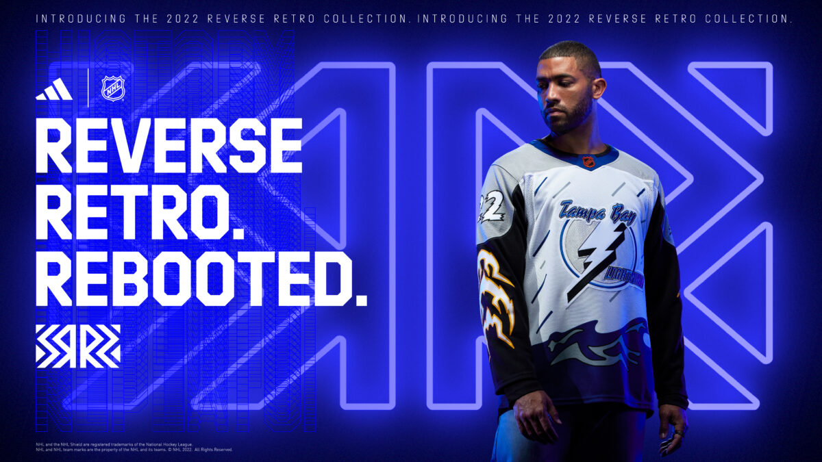
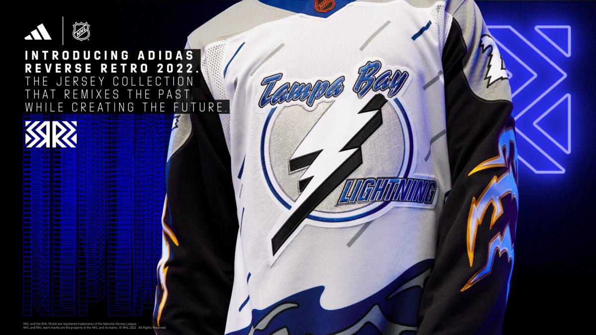
This leads us to the Reverse Retro 2.0 campaign for the 2022-23 season, where teams once again were tasked with remixing a past jersey to make a modern rendition that would bring in new fans while stoking nostalgia for the old. After how successful their 1.0 renditions were, it made sense to be excited about what the Lightning would do with 2.0, as many long-time fans believed they could break out a design that has a cult following for being brazenly overdesigned, ugly, impossible to describe in words, and to many, actively offensive to look at.

Well, folks, they did it. The Lightning brought back the “Storm Jerseys.” Just like when they first took it on the ice in 1996-97 for six games, these jerseys are an absolute mess that are an affront to anyone who has worked in the design industry for more than a week. To put it bluntly, they are objectively ugly…
And yet, these jerseys are absolutely perfect.
Reverse Retro 2.0 Reminds Lightning of Their Difficult History
The early years for the Lightning were rough. While they experienced the typical trials and tribulations of any expansion team from the era (let’s face it, at the time the NHL didn’t set their new teams up for success at the expansion draft), they had more issues than just a mediocre on-ice product.
First, the Tampa Bay market is difficult to break into for any sports franchise, as it is a football-focused town where the Tampa Bay Buccaneers and college football stalwarts dominate the conversation. In order to get a foothold in the market, the Lightning needed to be good (which they weren’t) or find gimmicky ways to steal headlines. They managed to do this a number of times, like setting a then NHL attendance record of 27,227 back in 1993 in the “Thunderdome,” and even the original launch of the Storm Jersey can qualify as well, but these moments were few and far between.
Along with struggling to find their place in the market, Tampa Bay also had a tenuous ownership group, as Phil Esposito relied upon a consortium of Japanese Business companies led by Kokusai Green to fund the $50 million expansion fee back in 1990. This group let the franchise languish, as it was foundering money, lacked a proper scouting department, failed to put a competitive team on the ice most seasons, and was viewed as a dead franchise by many as early as 1996. If not for its sale in 1998, it’s very possible the Bolts could have been taken over by the NHL and moved out of the city entirely by the new millennium, which would have marked it as one of the worst sports ventures in North American history.

Despite winning the 2004 Stanley Cup, rumors of the Lightning being sold and moved out of Tampa Bay persisted until Jeffrey Vinik bought the team in 2010. Since Mr. Vinik purchased the franchise, the team has experienced one of the greatest turnarounds in sports history, as the once floundering team has become a model of on and off-ice success. Now with a packed stadium every night and two more Stanley Cups in their trophy case, there’s little concern about the future of hockey in the city of Tampa.
Lightning Are Lucky to Wear Storm Jerseys Again
While this may feel like a lot of weight to put on what amounts to a marketing gimmick to help sell more jerseys, the Lightning’s Reverse Retro 2.0 Storm Jersey is far more than just a marketing gimmick. They represent the culmination of 30 years of trials and tribulations from a franchise that was destined to fail but still found a way to eventually thrive despite all odds.
The fact that the Lightning were able to survive long enough to see a once reviled design from their early history becoming a nostalgic showpiece is a sign of just how far they have come, because the Storm Jerseys should have been nothing more than a weird footnote in the NHL’s history when discussing a failed franchise. Instead, we live in a world where they will be readily available to purchase for the first time in 25 years, and we will get to see this beautiful mess on the ice once again.

So yes, the Lightning’s Reverse Retro 2.0 is ugly, and I expect it to be at the bottom of many power rankings discussing the release. However, it means far more than the sum of its overdesigned parts to the fans who will be proudly wearing it at Amalie Arena for years to come.
