There are few things more important to a team’s identity than their jersey. Sure, a jersey is ultimately nothing more than an aesthetic design that doesn’t affect what goes on during a game, but they are also a direct connection for a franchise to their fans.
For the Tampa Bay Lightning, their jersey history has been a bit of a mixed bag. At the start, they had a bold blue, black and white color scheme that looked sharp but also was a bit busy.
Related: Tampa Bay Lightning Jersey History
Then, they started playing around with logo sizing, color schemes and added in a third jersey that was, let’s say, inspired. Finally, when the Lightning got a new logo and a bit of a rebranding in the early 2010s, they saw their uniforms go from unique to a more classical look that was functional but felt derivative of a traditional market like the Toronto Maple Leafs.

Due to the current uniform set being a bit boring, Lightning fans have been excitedly waiting for something truly different to shake things up. While the franchise tried with their current thirds, even those look a bit samey for all the hype behind it.
This made the announcement of the Reverse Retro jersey series so exciting for Tampa Bay. If done well, these would offer something different that could get a bit weird and mix up the current look.
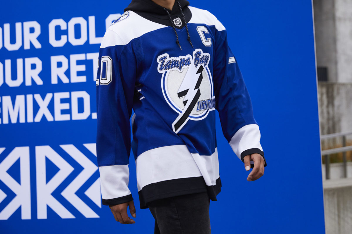
Well, after a few weeks of hopeful anticipation, the new jerseys were officially revealed and, I can say with confidence, that adidas nailed their design for Tampa Bay.
Lightning Balance Nostalgia With Modern Design
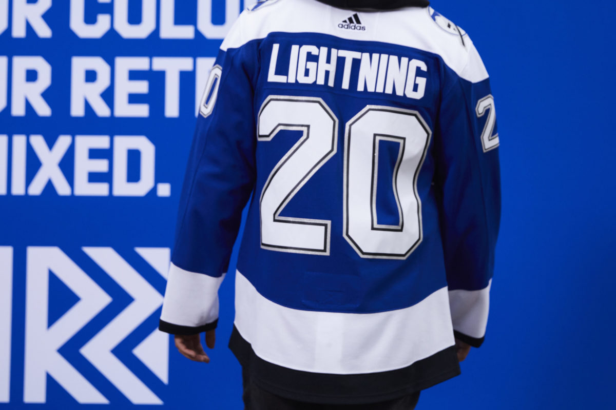
The concept of the Reverse Retro jersey is a tricky one, as it’s difficult to make something look as good as it did in your memories while still pulling at your nostalgia. adidas seemed to take this to heart with their design, which is definitively different from anything the Lightning have worn before, but still holds the same heart of a retro look.
It starts with the color scheme, which pulls from their 2004 design but uses a deep blue as the primary color that makes the jersey stand out from the past. So, this is a similar look to the one you remember the Lightning wearing when they won their first Stanley Cup, but the blue makes it feel brand new.

Also, while bringing back the original primary Lightning logo and secondary shoulder patches was the only right option for this jersey, it just looks so good seeing these again. While the current logo is fine, the classic logo is, nostalgia aside, still a thing of beauty.
Sure, they could have done something funky with the numbers to call back to original, but I think they rightfully decided to leave the shadow boxing effect in the 90’s, where it can stay a positive in our collective memories.
Reverse Retro Jersey is What the Lightning Needed
Perhaps the most important detail on this entire jersey is the victory striping under the arms. This is a little thing, but it was a must for fans. That striping is something unique to the early years of the Lightning, and it will mean a lot to see it back on the ice, especially while Tampa Bay are the defending Stanley Cup champions.
Related: Lightning: Looking Back at the Golden Knights’ Expansion Draft
This is just another example of how adidas got things right with this jersey. It could have been a simple cash-grab, but it really feels like someone sat down and thought, what will Lightning fans want out of a retro jersey in 2020-21?

So, would it have been fun to see the storm thirds back on the ice for the 2020-21 season? Yes. But, did adidas make a jersey that is nostalgic while still holding a modern look that fans will be excited to wear? Resoundingly, the answer here is yes.