The Vegas Golden Knights are a paradox.
For one, they’re an ice hockey team based in the desert. The National Hockey League’s success – or lack thereof – in such markets doesn’t exactly inspire great confidence (see: Coyotes, Arizona). Plus, the Golden Knights were the first major professional sports team to call Las Vegas home – another substantial risk, especially for the least-recognised of North America’s “Big Four” professional sporting leagues. Furthermore, Vegas has a myriad of other entertainment options besides hockey, options far more established than puck-based competition.
And yet, early returns are positive beyond anyone’s wildest dreams. The team has embraced the city, and the city has embraced it right back. T-Mobile Arena is packed every night. And merchandise and ticket sales aren’t just good, they’ve gone so far as to help boost the NHL’s salary cap.

As for the on-ice product, in true Las Vegas fashion, the ragtag Golden Knights have put on a show. Their very first season, they defied almost all expectations, having not only made the playoffs, but then going all the way to the Stanley Cup Final.
Show-offs.
Vegas’ Golden Marketing Strategy
In all seriousness, it really was nice to finally see the realisation of this long-rumoured team in Las Vegas. I’m sure the local population is ecstatic their city is finally known for something more than excessive gambling and shotgun weddings. The NHL certainly stepped up with some pretty generous expansion rules, but no one could have foreseen such a competitive product right out of the gate.
One thing’s for sure: It’s nice to see, at long last, an NHL team that is properly marketed.

But the best marketing a team has is their uniform; more specifically, their jersey. These are what will be donned by the players, seen in the stands and worn with pride around the world.
So how did they do?
Home Jersey
Let’s start with the home jersey, as, let’s be honest, few of us on the correct side of the continent ever stay up to see these threads in action.
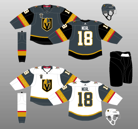
I mean, it’s not like it’s awful or anything. The logos are fine. The colours are good (individually, at least). It has reasonable balance to it. And yet, it just might be the dullest thing I’ve ever seen.
This is supposed to be Vegas! Where are the lights, the tassels, the extravagant excess? I thought this was Sin City!
The tail striping is passable, with a thin golden stripe (I believe this particular shade is known as “Vegas Gold”) directly atop a thick wad of black. The sleeves are a different story, with a large chunk of black topping a mid-sized golden stripe (inlaid with a really neat textured pattern), with a thin band of red around the bottom of the colour block (why red wasn’t included in the tail striping is anyone’s guess). This messy, disjointed striping situation reminds me of the Arizona Coyotes. A black crew-neck collar, lined with red and a “Vegas” wordmark, finishes off the jersey’s decoration.
But perhaps the worst thing about these jerseys is the slate grey background. Even the official name for the colour (“Steel Grey”) can’t spice things up. This dreary shade completely washes out what should otherwise be a really fun, punchy colour scheme. The logo, simple and appealing in an eerie, ghostly sort of way is, nevertheless, fairly bland in tone, so I would’ve liked to see red used as the primary colour for these kits. It would contrast nicely with the darker, duller logo and striping, and could be paired with a dark-coloured helmet and gloves for optimal contrast. Check out the red on the sleeves and shoulder patches, and tell me it wouldn’t look great as the background colour in this palette.
Alas, no such luck. We’re stuck with a home jersey that looks like a print job that ran out of colour halfway through.
As for the rest of the kit, the sock striping seems to be simply a reversal of the sleeves, with a grey helmet, black pant and black gloves (trimmed with gold, like the jersey numbers) rounding out the design.
All in all, there’s a lot going on in this uniform. The primary colour was a poor choice. The striping is weird. And the white font sticks out like a sore thumb, considering there are no other white accents. Truly, a symphony of befuddling dreariness.
The Golden Knights gambled – and lost.
Away Jersey
The road kit retains many of the same problems as the home, most notably the messy, inconsistent striping. However, the use of white as the primary colour is a marked improvement over the grey. It greatly brightens up the jersey, making the logos and striping blocks really pop.
Were I forced to spend my hard-earned money on one of these two designs, I’d definitely pick the road kit. Even though it’s more or less the same in layout, grey being relegated to secondary colour status makes the entire product look cleaner, sleeker and altogether more professional. Vegas can at least take solace in the fact they look sharp in other teams’ barns.
This crisp, contrasting look is only enhanced with the Golden Knights’ use of black pants, and would be doubly so if the helmets were black, too. Not to mention the gloves. Seriously, ditch the white. It’s tacky and unbalances the entire uniform.
Third Jersey
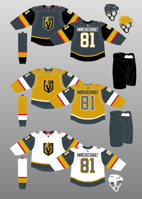
The Golden Knights debuted their third jersey in time for the 2020-21 pandemic-shortened NHL season, finally offering full acknowledgement of their name with a gold-dominant alternate. While the intent is clearly there, these alternates fall short of the full Vegas flash you might expect, especially for a third jersey that’s used less regularly.
Unlike the blindingly shiny gold helmets that sent hockey Twitter abuzz this past season, the alternates are surprisingly muted. The gold colour gives off more of a mustard-y vibe, bringing to mind the Nashville Predators’ uniforms, as opposed to the gold coins used in glitzy casinos on The Strip.

(Illustration by Andrew M. Greenstein, The unofficial NHL Uniform Database)
Perhaps a true gold colour scheme would have been sensory overload for fans and opposing players trying to keep track of the Golden Knights as they zip around the ice. The helmets were overwhelming enough! But still, the unveiling of their thirds was rather unsatisfying for those of us hoping to see the organization fully own the Vegas image. Instead, this just felt like a ‘one foot in the door’ attempt that doesn’t fully commit to what they’re going for.
‘Reverse Retro’ Jersey
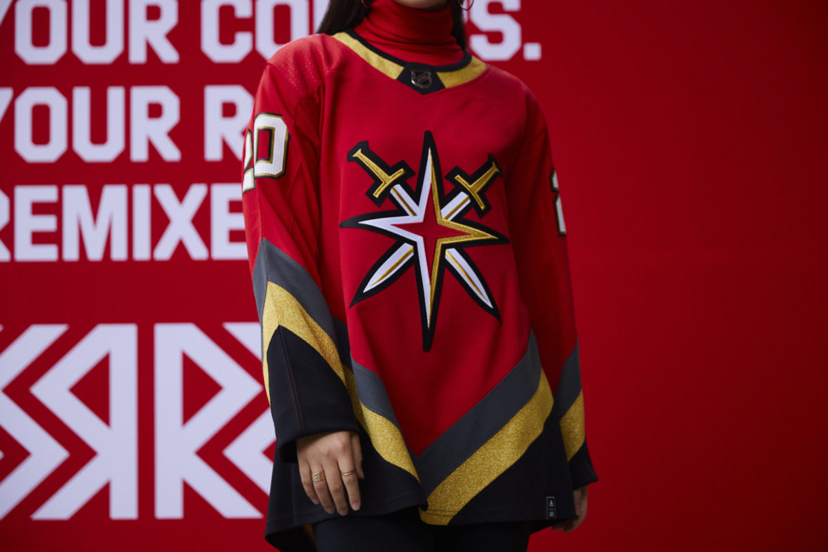
Yes, I know – nothing associated with the Golden Knights should really be considered ‘retro’ four years into their existence. That being said, Vegas got creative with their handling of this league-wide venture, finding eye-catching style while drawing inspiration from sources beyond their own admittedly limited franchise history.

The style, itself, makes it pretty hard to quibble with the ‘retro’ terminology. The bright red that serves as merely a subtle accent in other iterations of Knights’ jerseys – to the point where you could be forgiven for wondering what red is doing in a Golden Knights’ colour scheme – it becomes a central focal point here. The sleek star erupting from two crossed swords remains on theme while moving away from the standard ‘V’-embedded helmet logo.
Latest Golden Knights Content:
- 9 NHL Teams That Missed in Free Agency
- Golden Knights Will Miss Jonathan Marchessault
- Islanders’ Lamoriello Needs to Follow Golden Knights’ Ruthless Trade Model
- Golden Knights Struggling to Address Voids in Forward Corps
- Golden Knights Took Major Risk With 1st-Round Pick Trevor Connelly
And there’s purpose behind the look, too. The Golden Knights’ reverse retro pays homage to the local, Nevada-based pro hockey clubs to come before the city got their own NHL franchise. Specifically, the V-shaped striping serves as a tribute to the Las Vegas Thunder of the International Hockey League, a team that once featured Manon Rheaume.
Golden Knights Jerseys Technically Beautiful
The easiest way for me to sum up the Vegas Golden Knights’ first attempt at an NHL uniform is to compare it to the fair city of Ottawa. Back in 2001, Ottawa attempted a rebrand, going with the slogan “technically beautiful.”
I mean, yes, Ottawa is the seat of government in Canada. It has nice museums. It’s very clean. It’s effortlessly bilingual. And yet, no one really wants to go to Ottawa. Somehow, someway, it just doesn’t come to mind as an enticing destination.
In the same way, the Golden Knights’ jerseys are “technically beautiful.” They’ve got two cool logos. They have a good colour palette. The striping, while unnecessarily busy and complex, is not egregiously offensive. And there are some nice textural elements on the sleeves and logo.
Everything is in place for a truly spectacular creation, coveted by hockey fans the world over. And, as mentioned, the road editions are decent enough. But the crown jewel – the home jersey – just doesn’t really…work. Like, at all.
That said, all things considered, it’s hard to be upset about jerseys if you’re a Vegas fan. You’ve got it pretty good.
**Originally published June 2017.