Winnipeg Jets fans have waited eight full seasons for their team to get a permanent third jersey.
The alternate duds, which were long overdue and unveiled Friday, were definitely not worth the nearly decade-long wait. The design that debuted is uninspired, bland, and quite simply, very boring.
Breaking Down the New Design
The new jersey — entitled “Aviator” — is bare bones and basic. Its main body is comprised primarily of the aviator blue that is a minor feature on the sleeves of the Jets’ current home and away jerseys. Instead of a crest or logo, it features the word “Jets” in a newly designed, but pedestrian-looking, semi-cursive script.
Modern. Classic.
Introducing the #NHLJets AVIATOR jersey.
DISCOVER ➡ https://t.co/3hRcRatg3N https://t.co/y4vZWZdlQB
— Winnipeg Jets (@NHLJets) September 15, 2018
The fact the jersey has a wordmark instead of a logo, in and of itself, is not surprising. Pictures from earlier this month showed the new wordmark on the Jets’ helmets, and the team also included keychains featuring it in their season ticket packages.
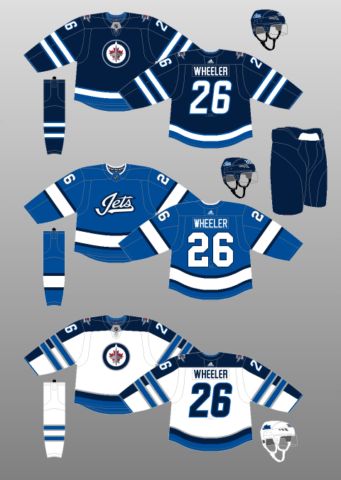
Underneath the script and on the sleeves, there is a wide stripe of white bordered above and below by thinner strips of black. The pants are polar night blue, while the socks mimic the jersey in colour and striping.

And that’s it. The design lacks even a hint of red or silver, two colours on the Jets’ regular home and away jerseys. There’s no patches — either the current Jets’ logo or a new incarnation of an airplane design —on the shoulders. There’s nothing on the collar except a thin strip of white and text “WE ARE TRUE NORTH” inside it, which no one will be able to see in-game.
The new design just doesn’t inspire much of anything at all and can be most generously described as cookie-cutter.
Can’t Hold a Candle to Heritage Classic Jerseys
The new look pales in comparison the gorgeous Heritage Classic jerseys the Jets wore during their 2016 outdoor game at Investors Group Field.

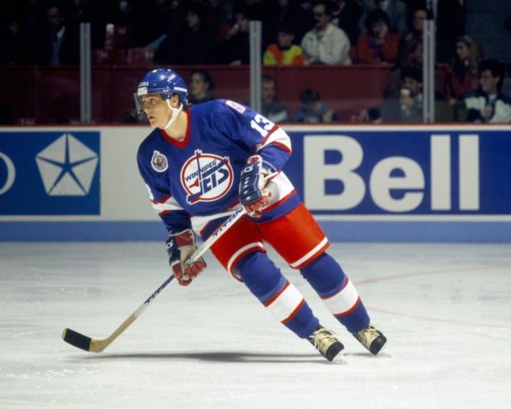
Nearly perfect in almost every way, the retro-style jersey used the logo introduced by the then-WHA team in 1973. While it featured modern touches and a slightly different colour palette, it was quite loyal to the original. The jerseys received acclaim and were snapped off the shelves faster than Patrik Laine’s wrist shot.
While stupendous, the design was short-lived. The Jets wore them three more times in the 2016-17 season before Adidas took over as the NHL’s jersey’s supplier and all Reebok jerseys were permanently shelved.
Many fans were undoubtedly hoping for the new alternate, announced in late August, would take on a similar look to the dearly-departed Heritage Classic threads.
Alternate Jersey Blasted Online
Reaction to the new design, which was leaked by Twitter account Icethetics a day before before the Jets officially revealed them, has been nearly unilaterally negative. On Icethetic’s post, and all around social media, people have been throwing plenty of shade at it, if not outright tearing it apart.
https://twitter.com/darrenford77/status/1040766174294884352
Reactions to Icethetic’s leak were swift, visceral, and hilarious. While many comments are not appropriate to quote here, some of the safe-for-work ones included “It’s almost like they forgot the deadline was coming up – and just handed something in for the sake of handing something in, “needs less plain and more plane,” and “that looks like a tourist shop knock-off.”
Some users chose instead to post GIF reactions, which included Judge Judy shaking her head, dumpsters on fire, and Darnell from My Name Is Earl reacting in horror. One user even compared it to Oreo cookie packaging.
Reaction on the Winnipeg Jets subreddit was much the same, and included comments such as “I was trying to write something diplomatic but really this sucks… and I hate it,” “looks like a sweater you’d find at Zellers,” and “I would not buy this jersey. And I really want another jersey.”
New Concept Simply Doesn’t Take Flight
You can’t fault True North for wanting to create something completely new instead of going back to the past like they’ve done before. However, Jets fans deeply revere their franchise’s history, most likely due to painful memories of losing the team and wonderful memories of getting it back. A Jets 1.0 inspired third jersey, based on one of the many they wore between 1972-96, likely would have been warmly received like the Heritage Classic jerseys were.

For a brand-new design to resonate with Jets fans, it needed to be something spectacular, and the new design is not. It’s just devoid of any “wow-factor” and or unique touches. Many of the new alternates Adidas has unveiled over the past few months have been outstanding and eye-catching. However, to borrow a phrase from baseball, this one is a swing and a miss. The Hockey Writers’ own Peter Farrell recently created Jets jersey concepts that were much more interesting and creative.
Based on the backlash, it’s hard to see people buying these these jerseys like they did the Heritage Classics. Some, of course, will love them, and it’s quite possible some will warm up to them as time goes on. Maybe the jersey will really pop on the ice — who knows?
However, it seems like paltry payoff for an eight-year wait. The fans deserved something more inspired and eye-popping than what they got.
What do you think of the Jets’ new alternate? Love them? Hate them? Leave a comment below.